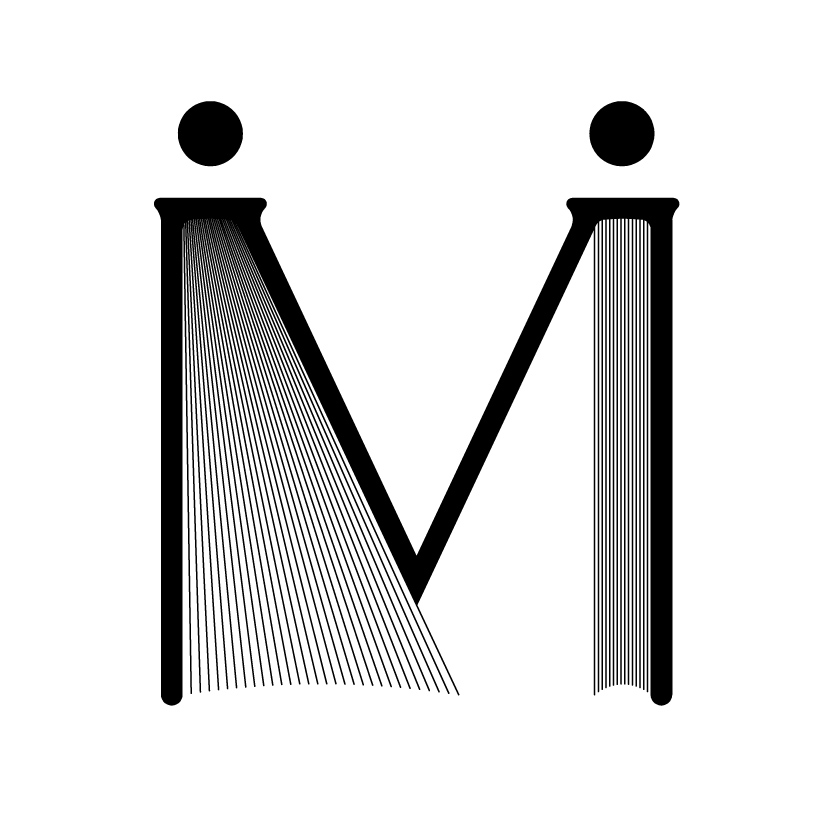
M like Moleskinerie by Sylwester Staniucha from poland
designer's own words:
The design is based on the shape and proportion of M letter, which is a shortcut of Molesiskinerie name. The logo is graphically connected with characteristic products of the company. Two figures holding hands are stylized on note-books- stable,strong and positive image of Moleskinerie company.
M like Moleskinerie
shortlisted entries (2162)