M for Moleskinerie by pedro alexandre castro pedrocastro4 from portugal
designer's own words:
in response to the objective of creating the logo for the blog moleskinerie, I developed a visual identity based on the concept of brand moleskine.
as such, and in order to keep pace with contemporary, i designed a modern logo, flexible and adaptable to this particular reality.
i now refer to the process of developing the logo, i started to draw several times the letter "m" with graphite, to find the most solved solution in order to be identifiable with the notebooks produced by moleskine and simultaneously maintain readability.
to the word moleskinerie on the logo i decided not to use a conventional typography but to creat my own typography.
the material used to achieve this result were the pens appropriate to typographic design and the use of brushes and various paints. after testing various designs i reached the final with the objective of being compared to a sketch out of a page of a moleskine notebook with which the spectator can identify.
logo
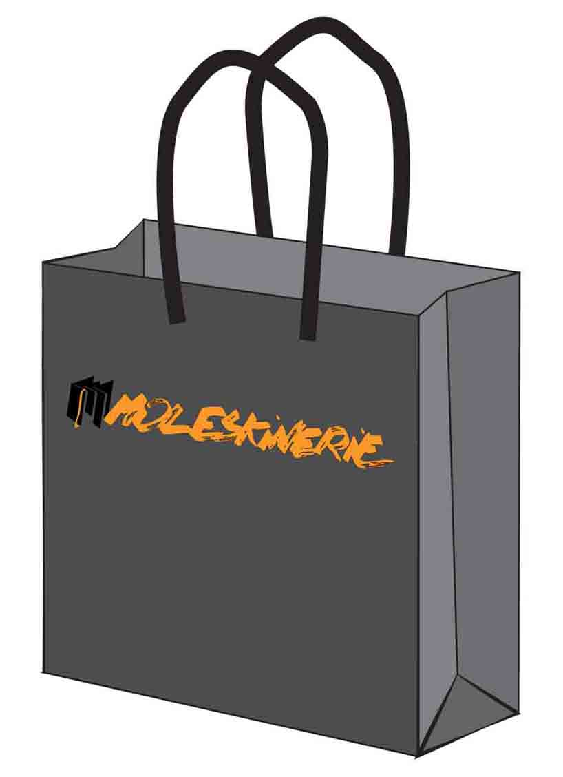 bag
bag
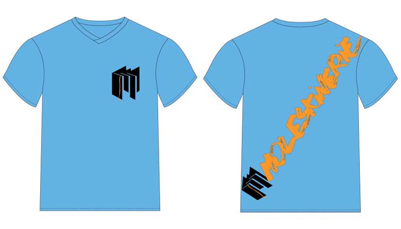 t-shirt
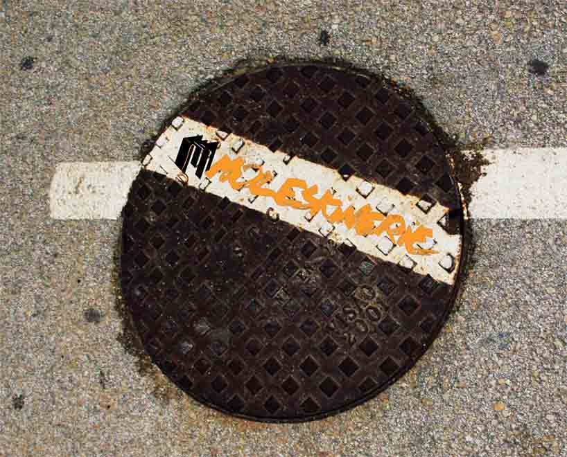 background
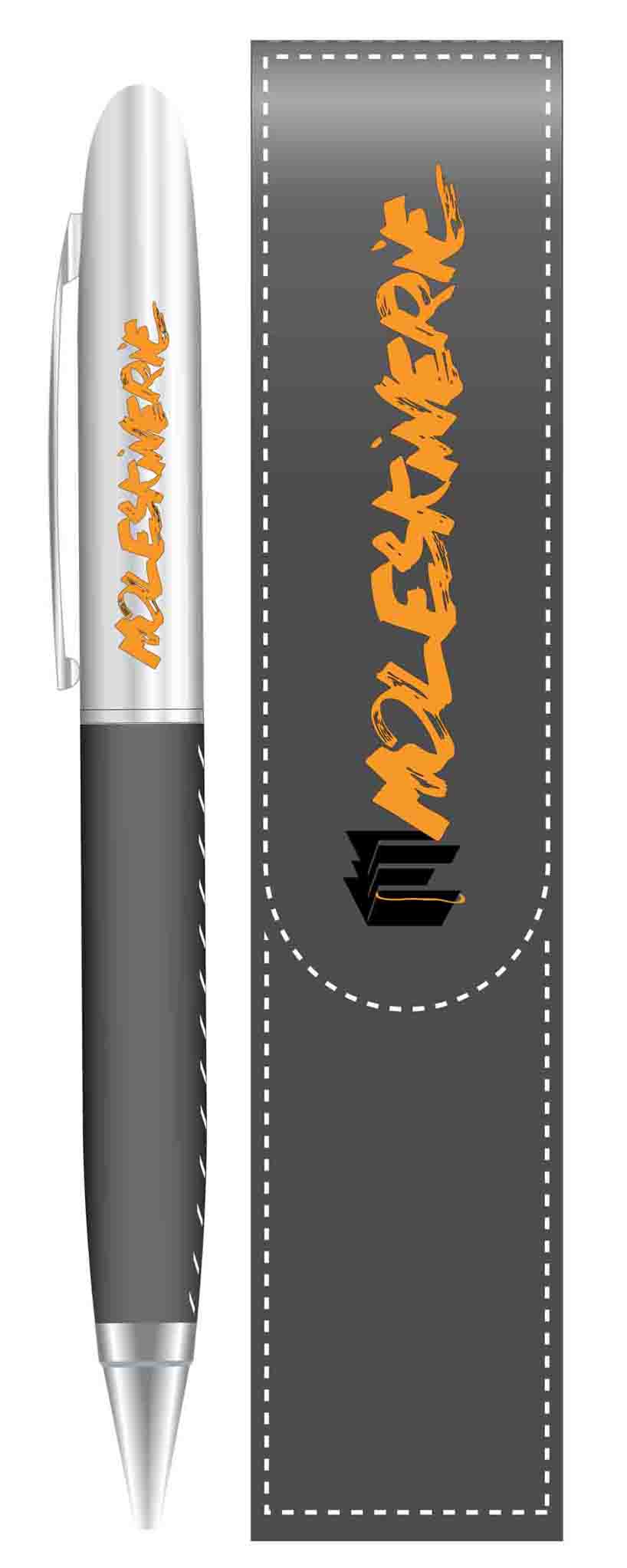 pen
pen
 notebook