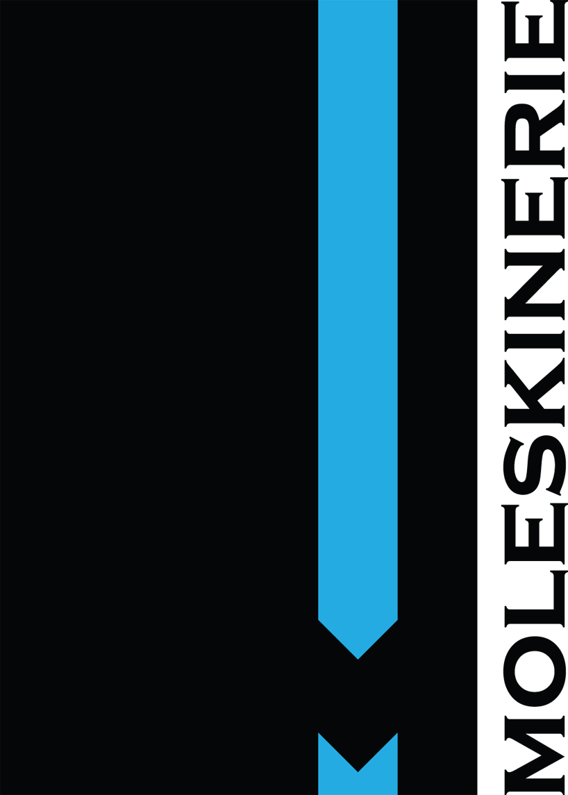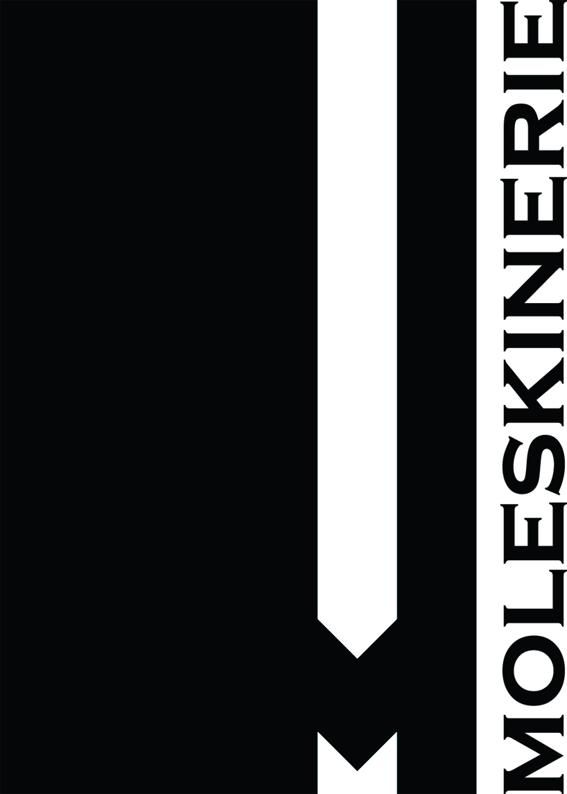
m by stanley wong from uk
designer's own words:
i have used the moleskine diary for my design inspiration. i have used the diary style for the shape of my logo with the contrast colour symbolising the elastic strap on moleskine diaries. i have used the letter m to match the moleskine brand. i have also used the brand's colour as well as it's font to enable blog users to recognise the brand.
i also believe that this simple design would be able to be printed, embrioded and embossed on any product.

shortlisted entries (2162)