'm' by minh toan truong from belgium
designer's own words:
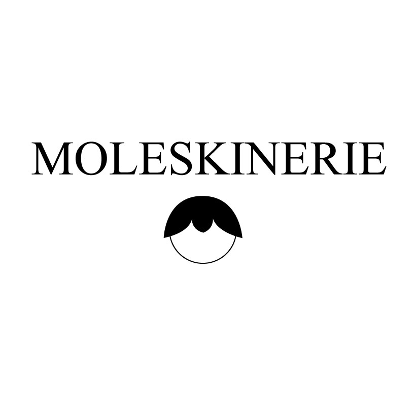
products of moleskine give us the opportunity to translate our thaughts into words and images. this notion is the foundation to design a meaningfull logo for moleskine. the ‘m’ of moleskinerie forms a leaf that embrace the contents like a shell that includes a pearl.
moleskinerie black
 moleskinerie grey
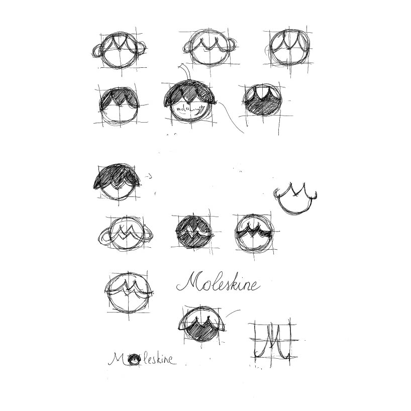
 moleskinerie process of design 1
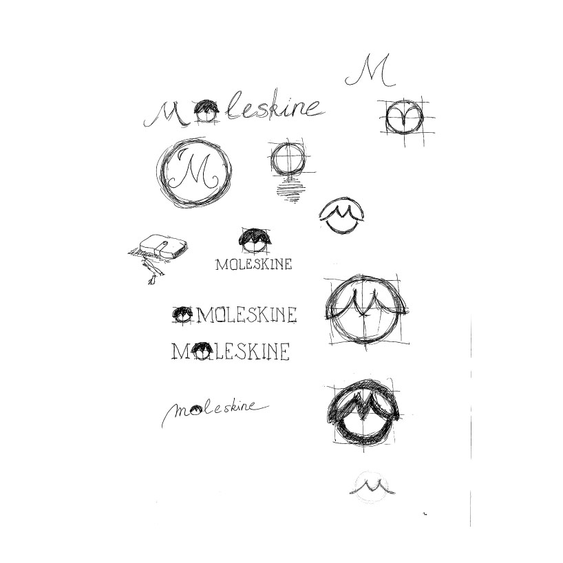
 moleskinerie process of design 2
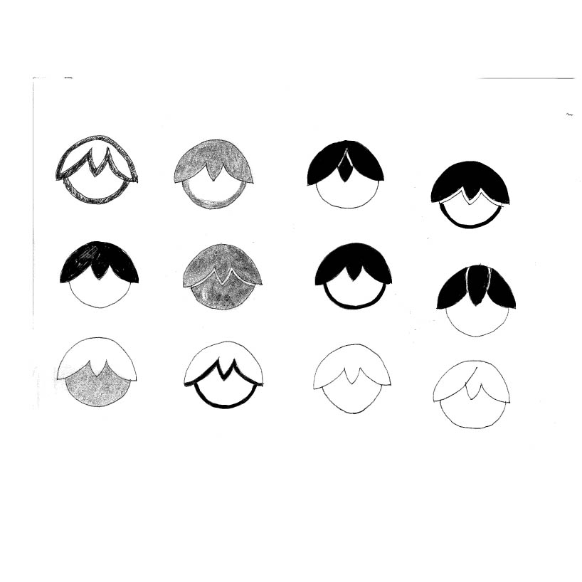
 moleskinerie process of design 3
shortlisted entries (2162)