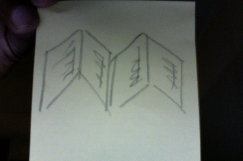
m by zulma edmondson from uk
designer's own words:
kept this in our heads for a while, to let it sink in. basically two open note pads next to each other creates an 'm" shape. m for moleskinerie. as you can see from the image we haven't crafted it or indeed even opened up adobe illustrator. we know there has been some controversy regarding this competition, and don't always agree with spec work. however as a designer it's our job to find solutions to problems - not sit there crying about how things should be in an idealistic world.
Our solution was simple, just keep the project in your mind, don't spend hours crafting something for free, let the brief sink in and proceed with your life, your day job. a good designer should be able to split tasks - if you come up with something, thats great, if you don't then its no big deal - move on.
after coming up with the general idea, this took all of 10 seconds to sketch onto a post it note and snap with our built-in camera. if moleskine like it, then they can do the decent thing and pay us to craft the idea into a final version. then we'll wrestle with execution, typography, photography or illustration.
if it isn't successful, who cares, we'll be busy on the next thing by then.