"M" by jie zhu from china
designer's own words:
let’s call this logo “m” at first. on visual, the shape of “m” is a metaphor of classic shape of moleskine notebook, which can be easily recognized by people using or familiar with moleskine. on meaning, “m” looks like a trail of trip, the red color on the trail means precious moment in the trip worth to memorize, that is also the reason why people like to using moleskine.
i set the “precious moment” with a color of dark red. i think this is a color with similar character as moleskine users, who is with passion but not loud and aggressive. who just memorize their passions quietly with moleskine.
of course, “m” can also have more color options which are more vivid than original “m”. this is also to align with the different colors applied on current moleskine products.
“m” even can have digital color options with better sense of dynamic while applying on digital medias.
logo
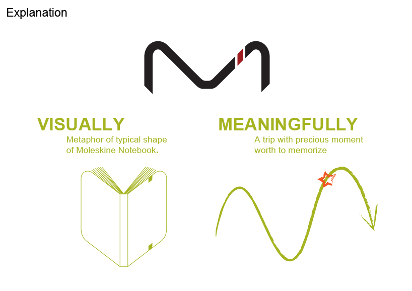 explanation
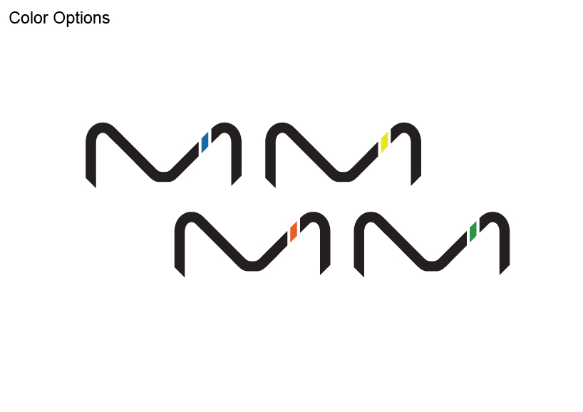 color options
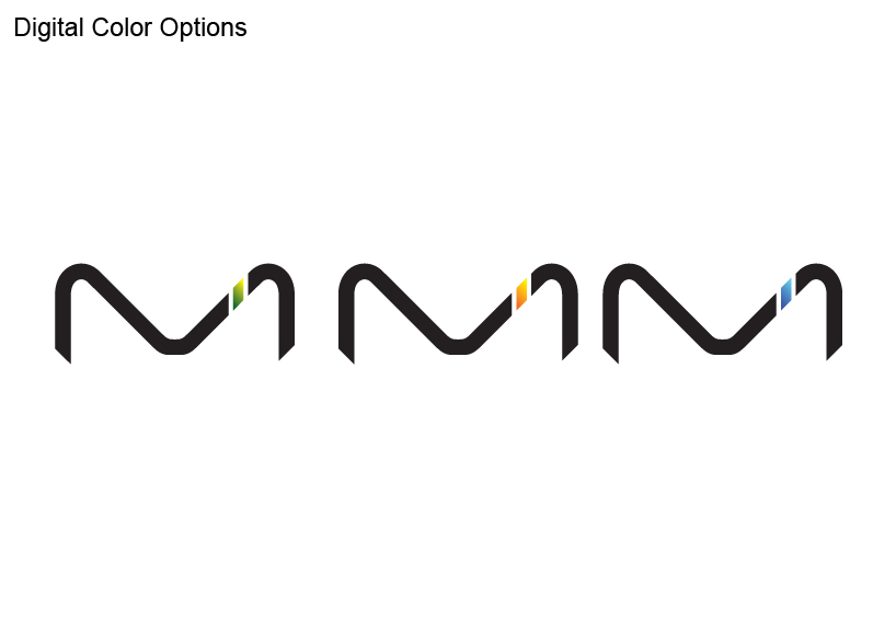 digital color options