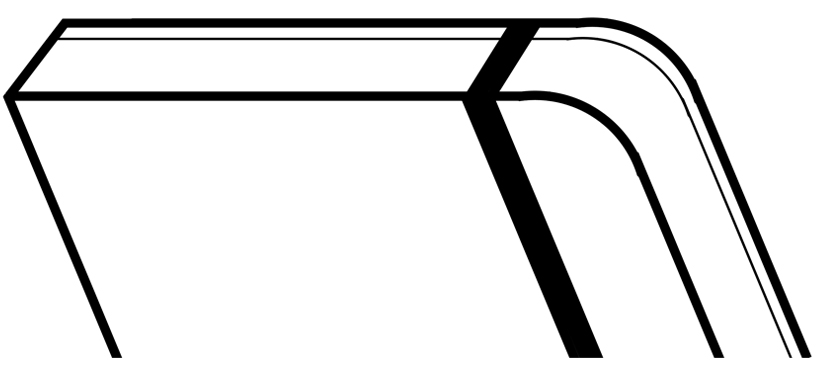
M by erick dizon from philippines
designer's own words:
Tapping the new media and market, the design is an endeavour to create a more modern logo yet keeping the classic shapes and elements. The diagonal lines also represent the letter “M” in more inconspicuous way, while the forms is a perspective of the traditional rounded corners and garter strap.
shortlisted entries (2162)