LVQR 90th anniversary design competition applicant (Melanie Yip) by melanie yip from china
designer's own words:
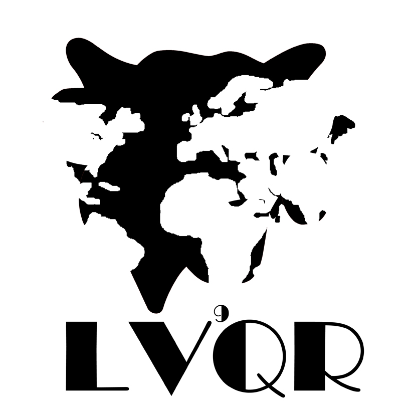
at the beginning, i have already wanted to incorporate the idea of "global" inside my design. it is because lvqr has remained to be a global brand for many years and its cheese products are well known to most of the population in the world. however,as i progress, i did not quite like my initial product as i thought inputting an entire world map inside the cow icon looked a bit odd. i was stuck and played around with the image. Then, I realize the color match of black and white looked much more neater and it suggested a vintage feeling across the design, which matched with the long history of lvqr. eventually, i even took away the stokes across the icon and it made the image looked rough and abstract, which I was quite satisfied as the product definitely looked stylish and unique. In simple words, I would be more than happy to carry a bag or wear a t shirt with such image on it, as it looks innovative and cutting-edge!