love + notebook by tiago camilo from portugal
designer's own words:
Specifications
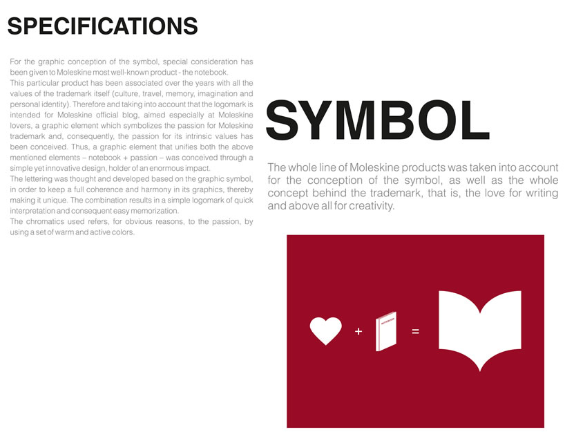
For the graphic conception of the symbol, special consideration has been given to Moleskine most well-known product - the notebook.
This particular product has been associated over the years with all the values of the trademark itself (culture, travel, memory, imagination and personal identity). Therefore and taking into account that the logomark is intended for Moleskine official blog, aimed especially at Moleskine lovers, a graphic element which symbolizes the passion for Moleskine trademark and, consequently, the passion for its intrinsic values has been conceived. Thus, a graphic element that unifies both the above mentioned elements – notebook + passion – was conceived through a simple yet innovative design, holder of an enormous impact.
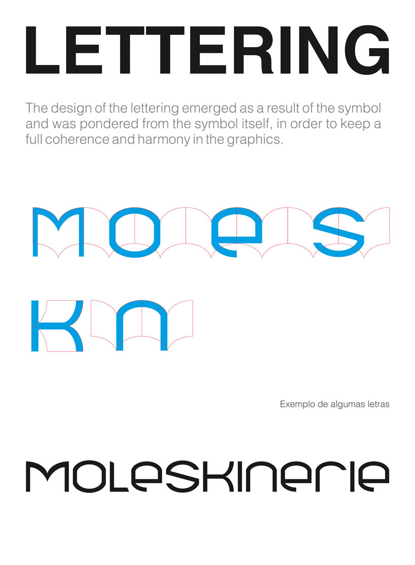
The lettering was thought and developed based on the graphic symbol, in order to keep a full coherence and harmony in its graphics, thereby making it unique. The combination results in a simple logomark of quick interpretation and consequent easy memorization.
The chromatics used refers, for obvious reasons, to the passion, by using a set of warm and active colors.
Symbol
The whole line of Moleskine products was taken into account for the conception of the symbol, as well as the whole concept behind the trademark, that is, the love for writing and above all for creativity.
Lettering
The design of the lettering emerged as a result of the symbol and was pondered from the symbol itself, in order to keep a full coherence and harmony in the graphics.
Logomark
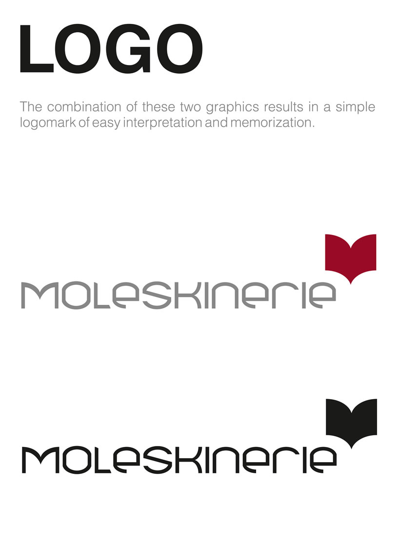
The combination of these two graphics results in a simple logomark of easy interpretation and memorization.
logo
 specifications
 lettering
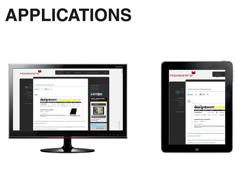
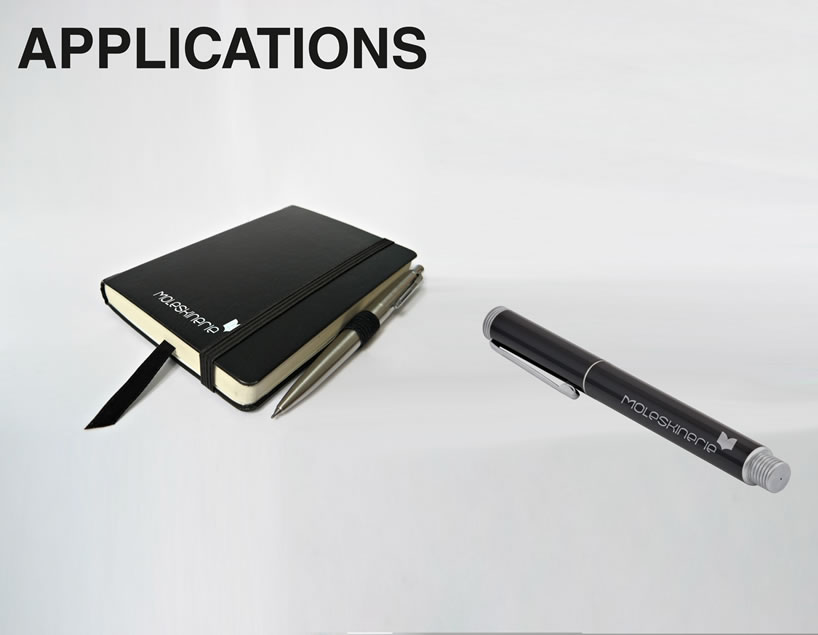 aplications 1
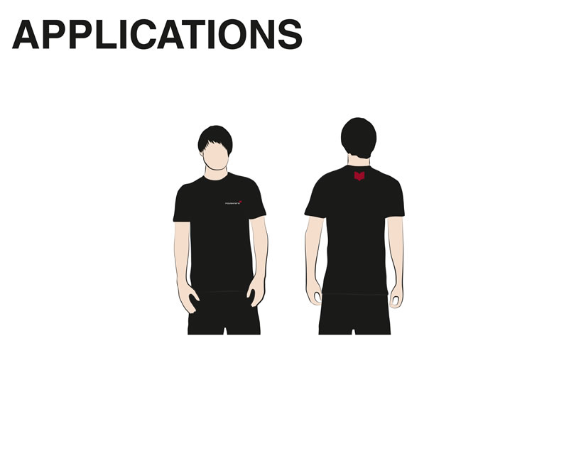
 applications 2
 applications 3