lost among the confetti by miroslava ivanagić from croatia
designer's own words:
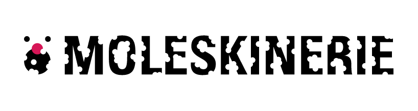
the logotype is made up of symbol on the left side and the text on the right side. the main idea was treating logotype as a paper from which are made confetti. as a product, we obtain a logotype that contains a transparent, complete and incomplete circles. they are always the same color as the background. text part of the logotype is designed to always be in non-color – black (in the so-called positive combinations). the whole main idea was realized by adding circles of different sizes to textual part of logotype from which was finally assigned a symbol that resembles the mole. symbol contains one non-color (black) and color. to be exact, a nose of the obtained symbol should be in color.
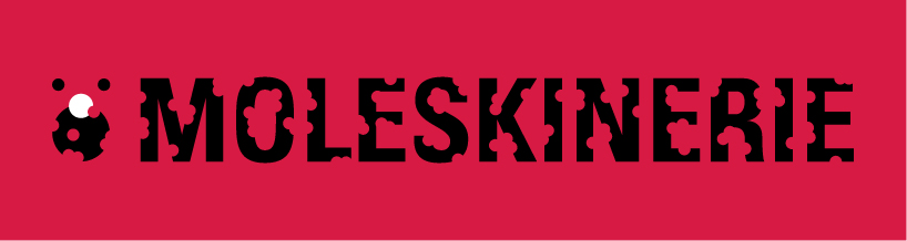
in addition to the basic combination of colors and non-colors: magenta and black on white or white and black on magenta background, it would be possible to combine with other colors and non-colors (two colors and one non-color or vice versa). logotype could be also realized exclusively with non-colors: black and gray on a white background, as well as in the so called negative combination.
the basic combination of colors (version 1)
 the basic combination of colors (version 2)
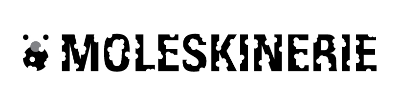 the basic combination in grayscale
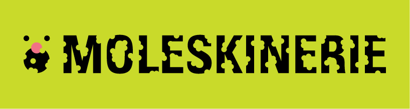
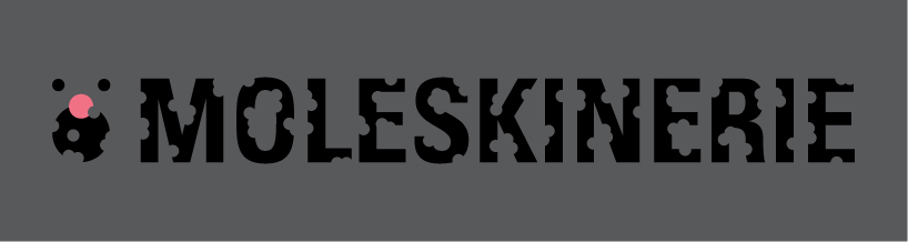 additional combination (version 1)
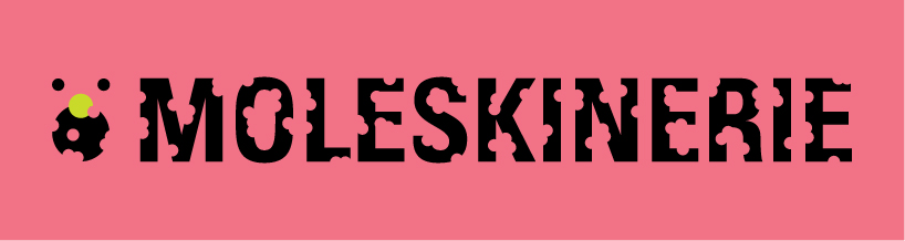
 additional combination (version 2)
 additional combination (version 3)