Loss Table by tom chau from new zealand
designer's own words:
loss table: for optimal study time
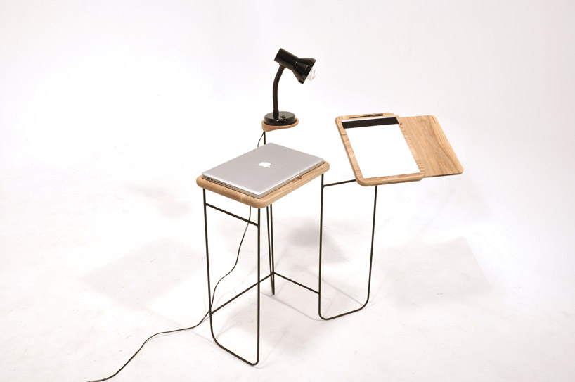
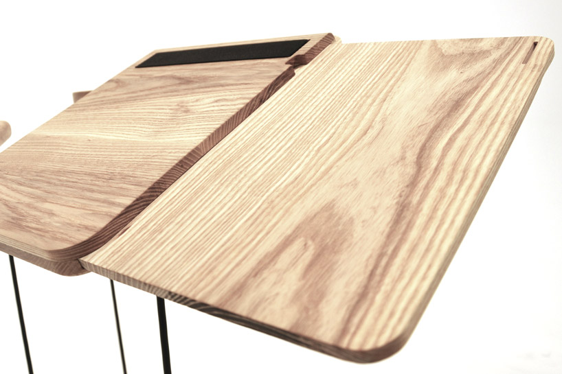
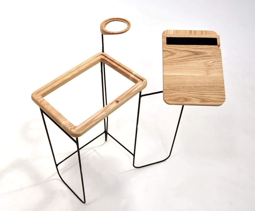
the loss table is a desk designed to persuade its users to be more organized while studying. made from sleek ash wood and a handcrafted steel frame, it combines affordance principles with clean aesthetics to produce a visually appealing design. the loss table utilizes study time more effectively, ideal for the user who is semi-organised but needs help differentiating between storage space and workspace.
original observations found that students kept their study space more organised at university than at home. this was because the students had a perceived risk of losing their personal items if they were not organised within the busy university environment. numerous studies have also proven that humans are more motivated by the idea of potential loss than potential gain. linked closely with scarcity principles, loss language can be used to persuade others in preventing loss, as opposed to securing a reward. the “loss table” combines these principles of scarcity and potential loss to persuade the user to be more organized in their study habits at home. the use of positive and negative space dictates where the objects may or may not be placed, with the risk of losing items that do not fit.
the loss table has been arranged specifically to only allow space for what is afforded, while the negative space reminds the user that they could lose their items if they aren’t placed in the right positions, thereby persuading them to keep their desk organized for optimal study time. affordance is a type of ‘behaviour steering design’ that lets the user know exactly how to interact with a product. one of the first theorists on affordance was james j. gibson, who claimed that we observe at the level of mediums, surfaces and substances as opposed to the level of particles and atom.
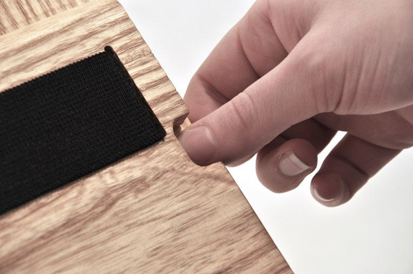
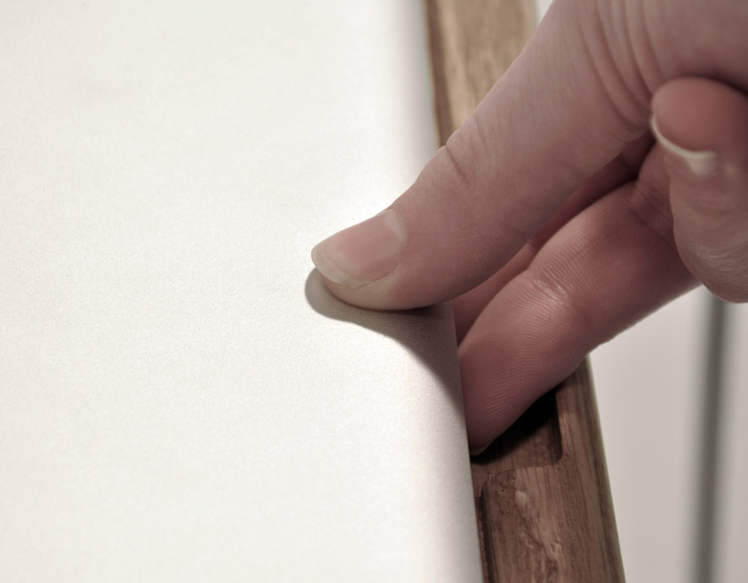
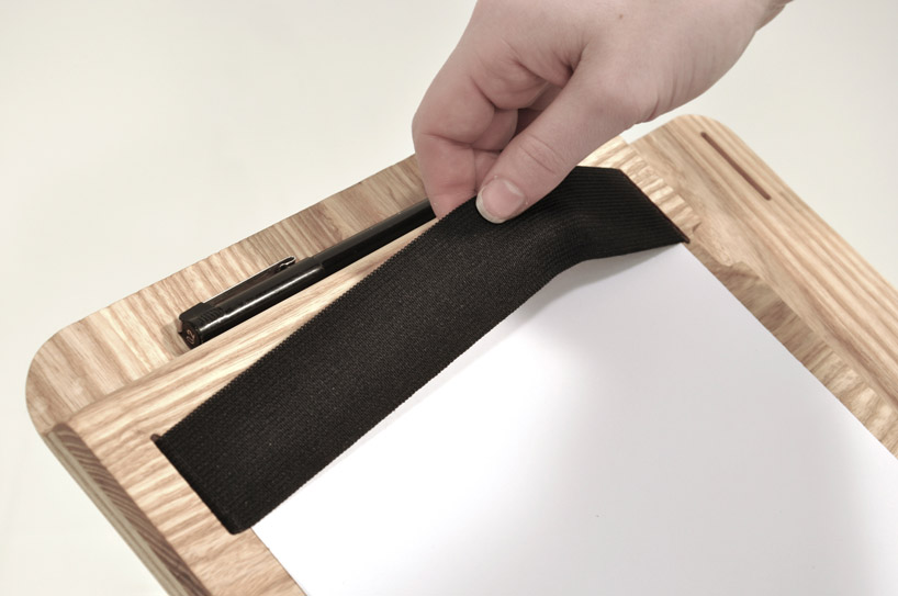
the affordances of the table include finger tabs for grip in the laptop space, a sliding piece in the writing space for open books, and elastic to hold loose paper. the assembly of each space has been carefully considered, offering room for a 15” apple macbook pro, a medium sized table lamp, loose sheets of paper, an open textbook and a pen. these are items crucial for optimum organized study and have been decided based on scarcity principles so there is no option for distraction. each area only allows positive space for the item it is intended to hold, nothing else, so that the opportunity for using unnecessary extra or distracting items is reduced. the negative space of the laptop and lamp pieces and the gradient of the writing space results in the loss of objects that do not belong, again persuading the user to place only the crucial items for studying on the desk.
