Logo proposal Episode I: A Line of Ink by andrei popa from romania
designer's own words:
My intention was to give the logo a handmade feel, steering away from clean and lifeless vectors. The logo (including the logotype) is hand made and looks like it was drawn with a marker (or pen). The symbol was important, and I gave it a little Moleskine touch, keeping everything elegant and balanced. The logo works great on any colored background, and in both horizontal and vertical layout.
Moleskinerie Logo
![]() Logo on background
Logo on background
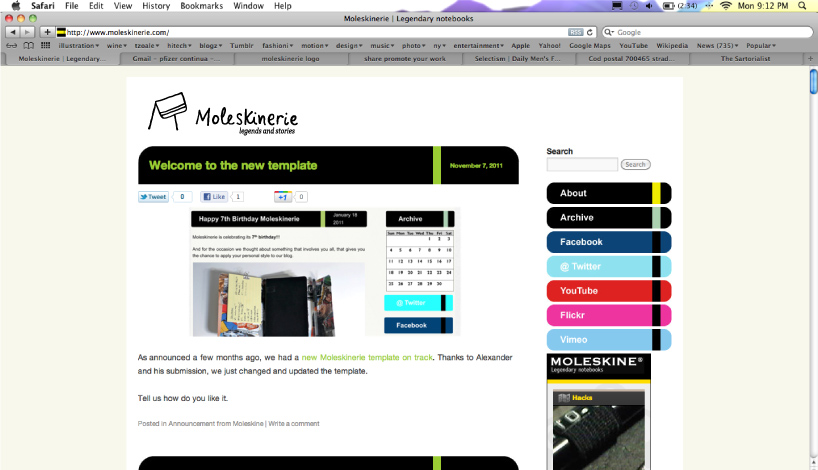 Logo on website
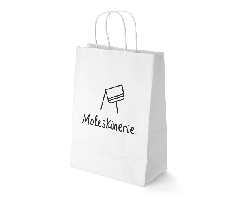 Logo on a paper bag
shortlisted entries (2162)