Logo Design of MOLESKINERIE by vishal prajapati from india
designer's own words:
Write up FIRST LOGO:
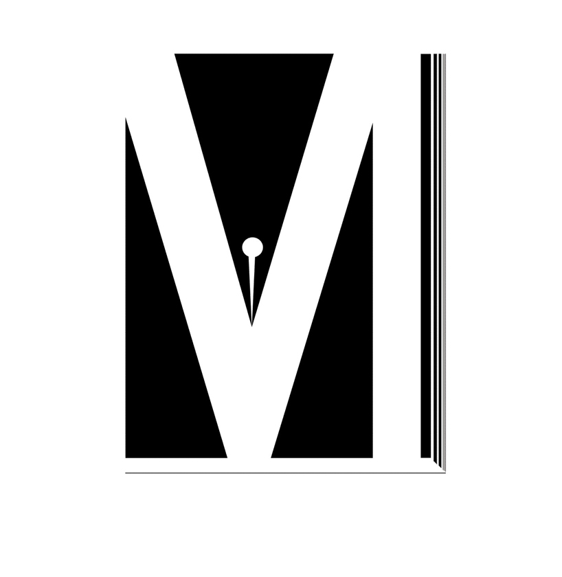
I have designed this logo for Moleskinerie . while conceptualizing I utilized the initial letter M . I have used negative and positive space and when viewed it looks like notebook or diaries with a pen in between. When kept on any other color background the negative space will be filled with the background color. The use of negative –positive space with different color background, defines the uniqueness of my design.
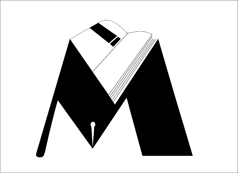
Write up SECOND LOGO: I have designed a logo using negative and positive space in which M looks like a book stand with open diary and a pen. The negative space of the diary when kept on any other background will be filled with the same background. This adds a unique feature of having a background color onto the diary negative space.
Writeup THIRD LOGO :
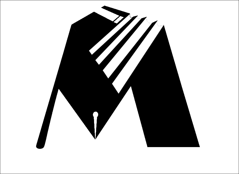
I have used negative and positive space and letter M as a book stand and a pen. The dairy has one main cover page which when kept on other color background shall acquire the same color.
Logo Design of MOLESKINERIE
 Logo Design of MOLESKINERIE
 Logo Design of MOLESKINERIE