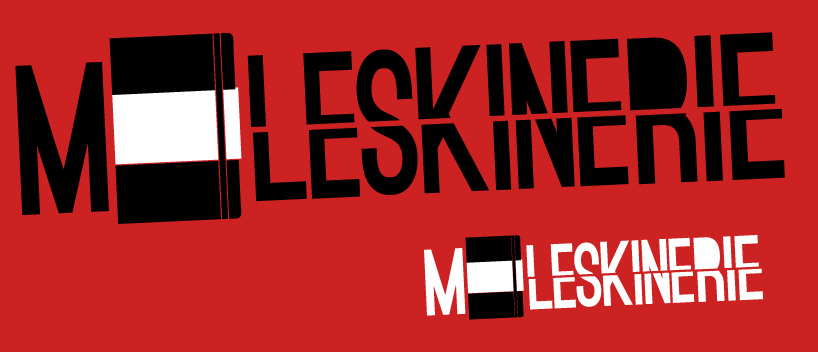
Logo 2 for the moleskine contest by maxence marolleau from france
designer's own words:
This one keeps the same principle as the first one (moleskine book as the "O") and the rest of the typo after the book is slashed because of the creativity. That's why the letter "M" is intact, it's before you use a moleskine book, that's the idea.
shortlisted entries (2162)