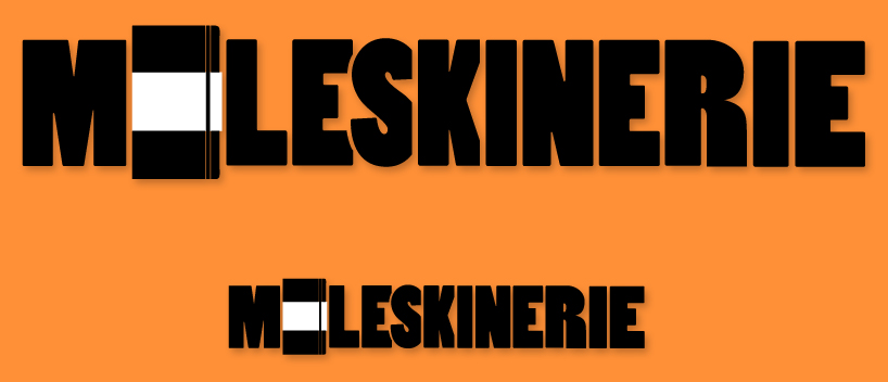
Logo 1 for the moleskine contest by maxence marolleau from france
designer's own words:
I used the moleskine book as the letter "o" in my logo and the rest of the typo is rounded and squared at some places to keep the homogeneity with the book.
shortlisted entries (2162)