Living images by Andrej Turcan from slovak republic
designer's own words:
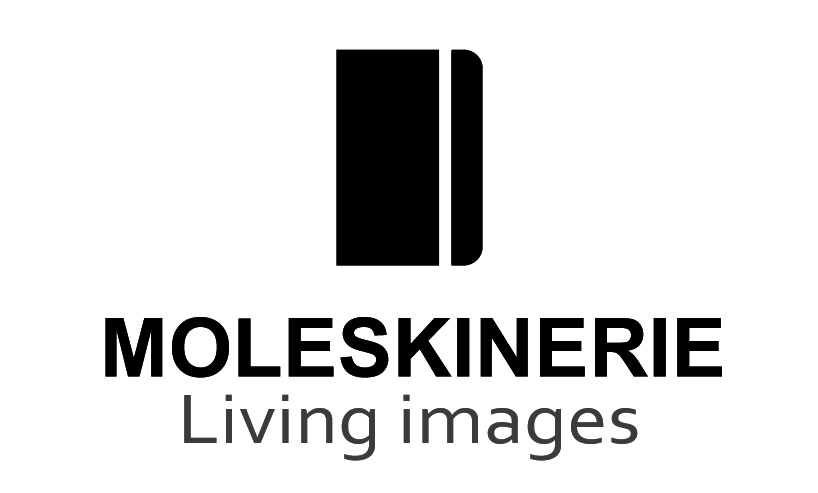
design of this project is based on the product of the moleskine and the moleskinerie blog, as a “sister organization”. texts, images, sketches, opinions, confessions like an abstract product (“software”) and moleskine notebooks like the concrete products (“hardware”). the project is synthesis of two parts to one living organism. (pic.4)
design of logo consists of two parts:
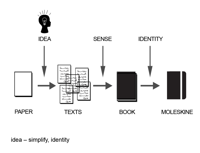
first – graphic sign – is based on the identity of moleskine notebooks, as an element which connects this community. it is the final product of the thinking process, its sign, identity, mark. just simple! (pic.2)
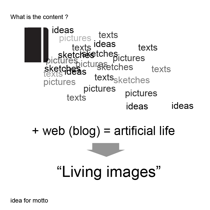
the second part – motto (text) – is based on the presented content (project, works and stories) of moleskinerie blog. it is his abstract form. images, which live, they are real at the paper, on the screen and in our minds. this blog helps to spread them, it breathes them the soul. just “living images”. (pic.3)


