little brick by rosy mattatelli from italy
designer's own words:
we started our work gathering together all the information we needed about moleskine, then we tryed to represent a minimal sketch of a typical moleskine notebook, in its one proportions, simply composed by two rectangles, separated by a line representing the elasticated strip on the cover of the moleskine notebook. the third step was the autocad draft, then we tryed different colour versions with photoshop: our logo can be reproduced in a single colour and it can be reversed out in order to work on any background colour, so we made different colour versions with different background colours. the design reads moleskinerie in "copperplate condensed" character, according to the usual moleskine brand. the size is adjustable from very small to large. we think that the final result of our work is a strong logo, because it is composed by simply but forceful and identifiable signs.
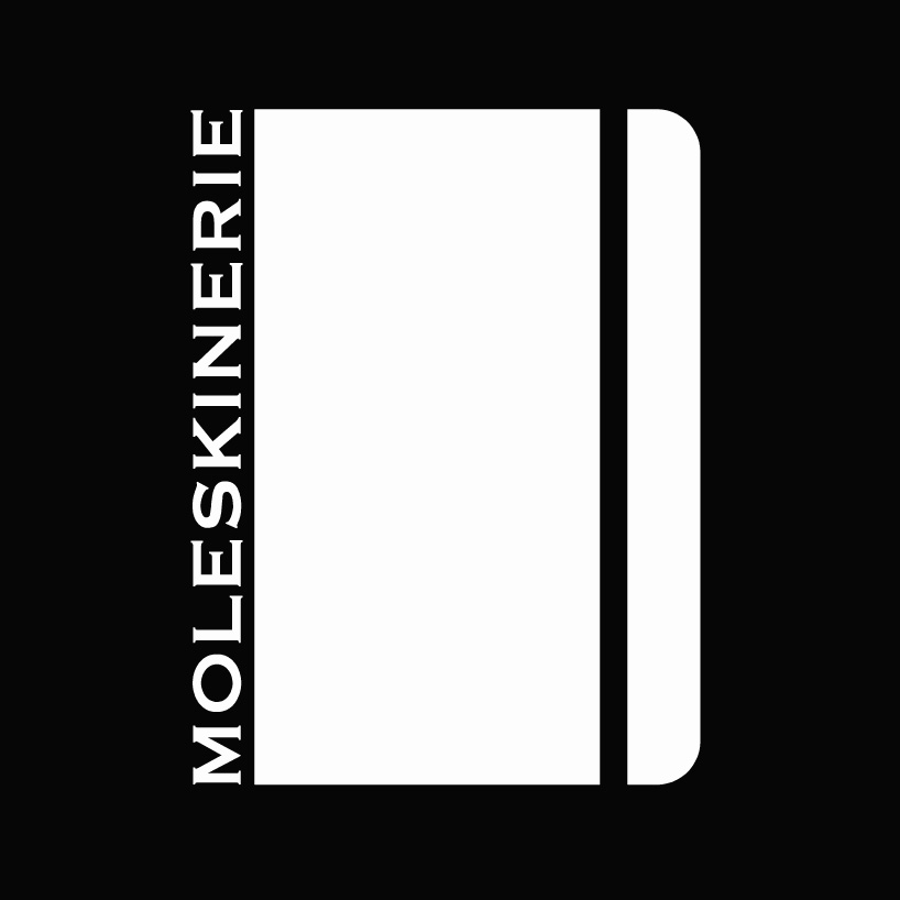
white on black version
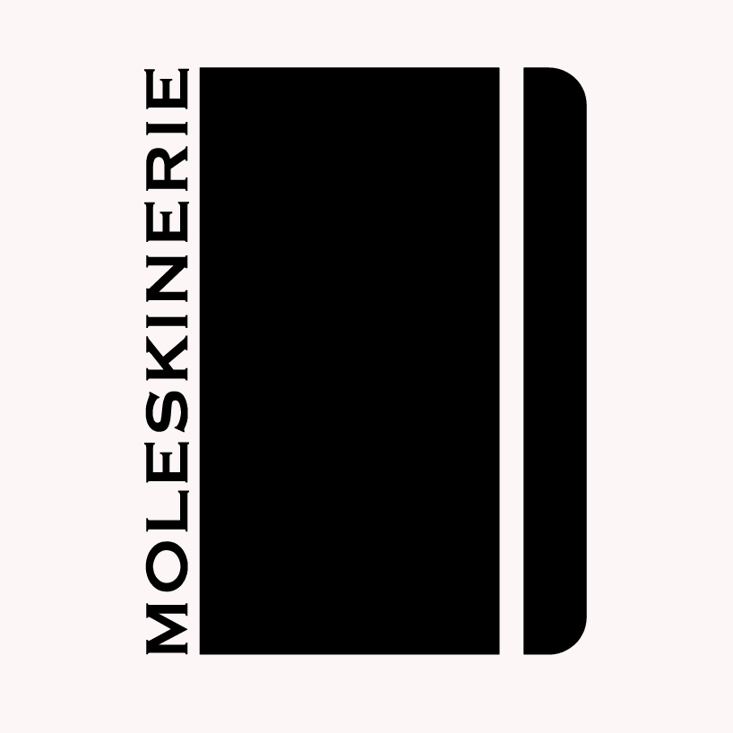 black on white version
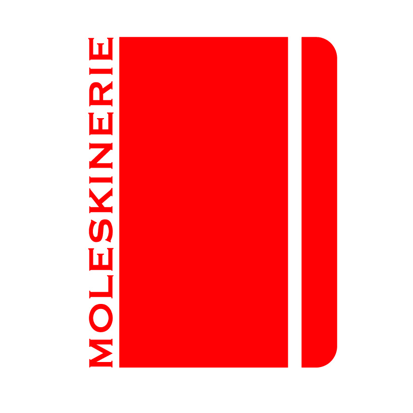 red on white version
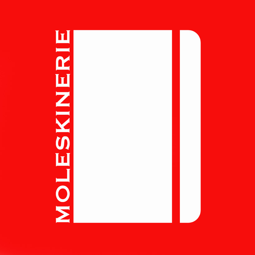 white on red version
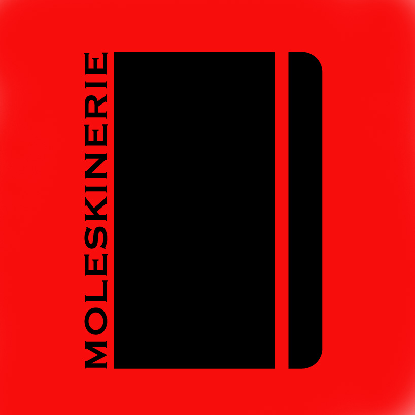 black on red version
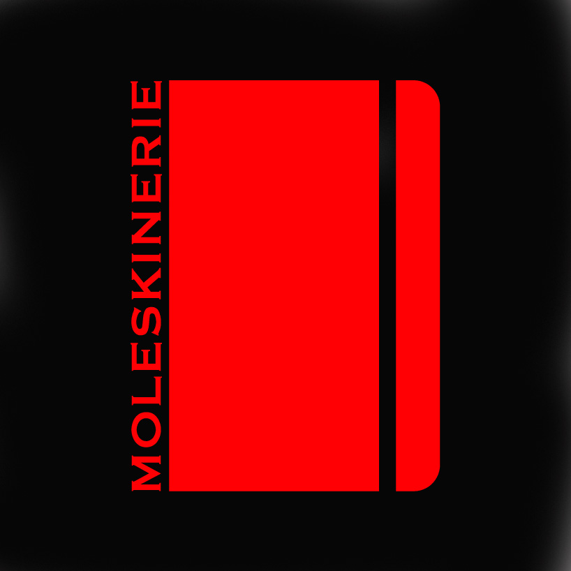 red on black version