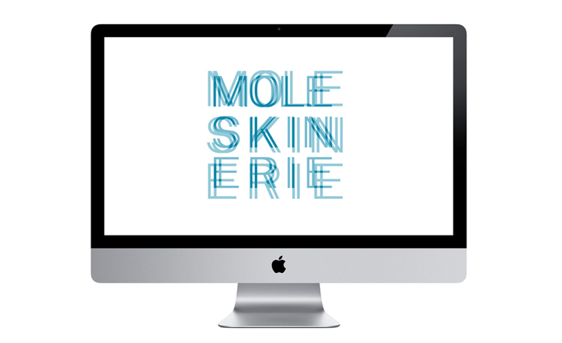
lines by ilija perkovic from croatia
designer's own words:
this project is focused on basic elements that are part of every moleskine notebook - lines. in an infinite number of forms they express our ideas, feelings.. literally, everything we want to express. so this logo pays them a homage. as moleskinerie is a rather long word, in this logo it is broken in three segments forming a square. this makes it easier to apply logo in various environments, so it always stands out.
logo black
 logo white
 logo monochrome
 possible application
shortlisted entries (2162)