lineage by rodolfo carvalho from portugal
designer's own words:
i tried to create a logo that could blend in the blog. After all, the briefing was to create an image for the blog itself. picking some elements of the blog and the logo of moleskine i created the moleskinerie logo. an image that can be identified as a part of moleskine and not as a different brand. That makes it more professional than some logo completely diferent from the moleskine logo that can be percepted as some fan blog. the lines are the lines of a sketch and from the pages of a moleskine book. the final image is a classically-modern brand that we can see as part of the moleskine empire and quality trademarks that it's known for.
cover
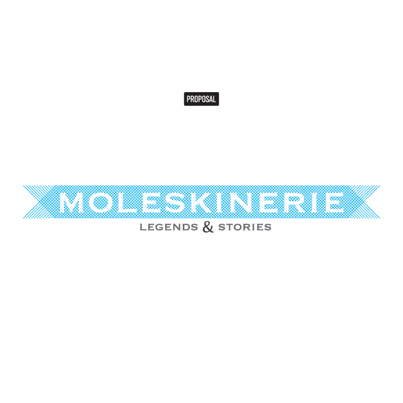 logo
logo
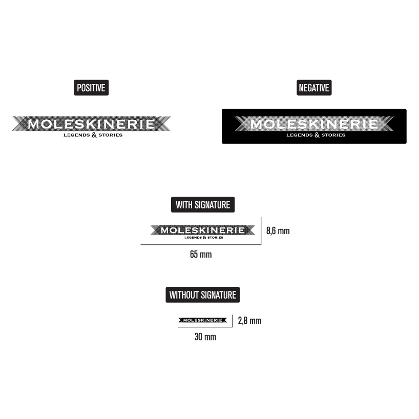 monochromatic and scale
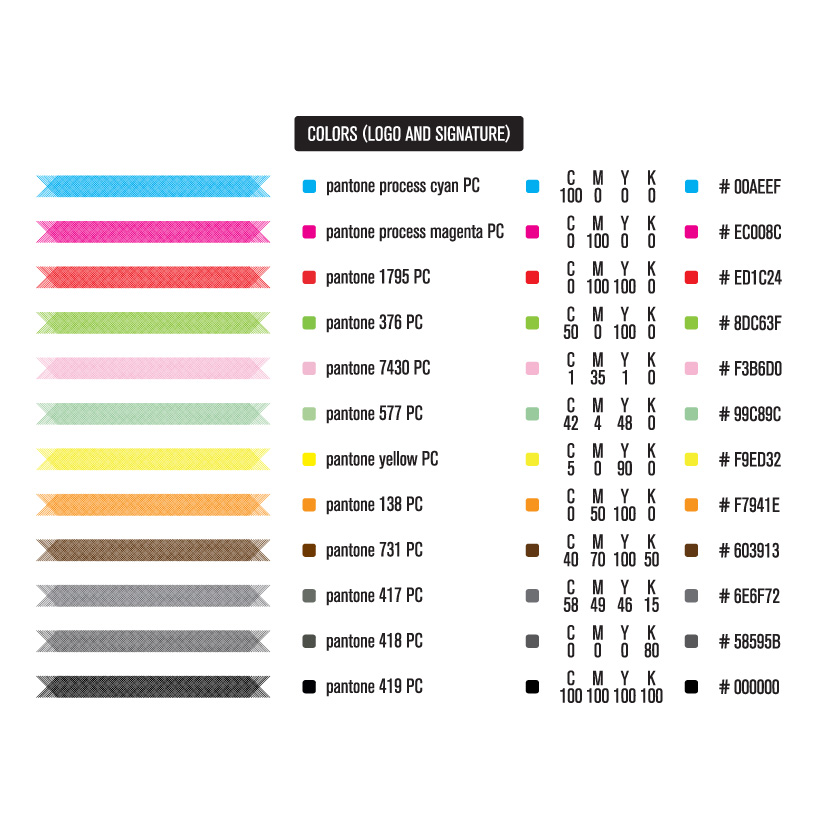 polichromatic variables
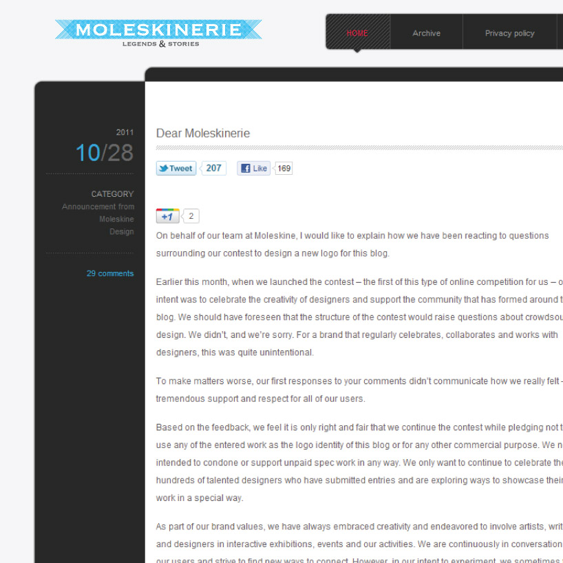 aplication in the old blog
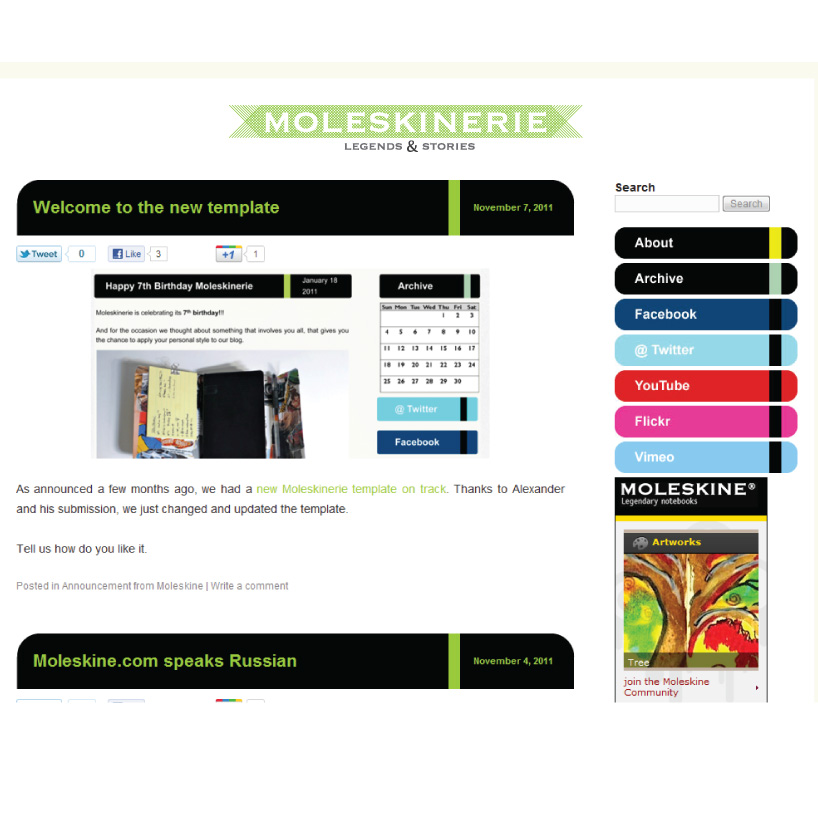 aplication in the new blog