lightning by arkadiusz szenfeld from poland
designer's own words:
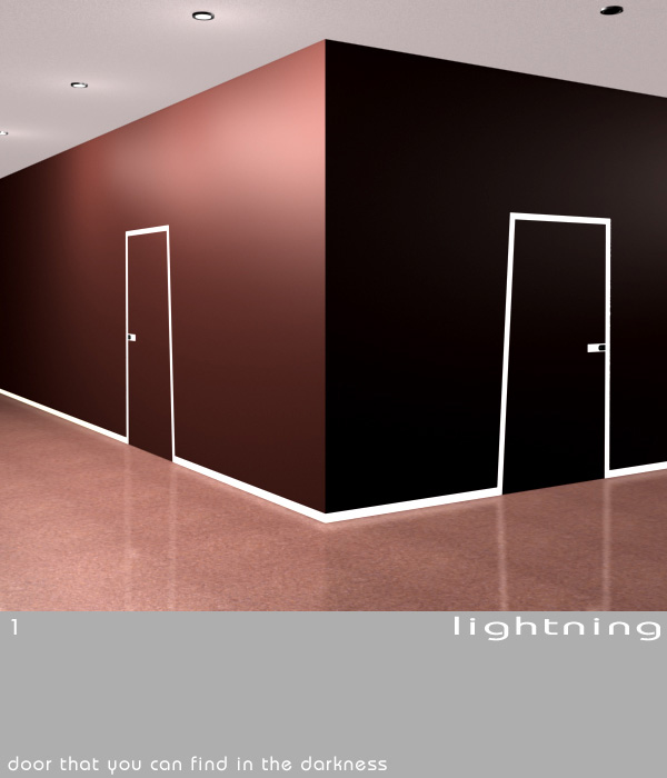
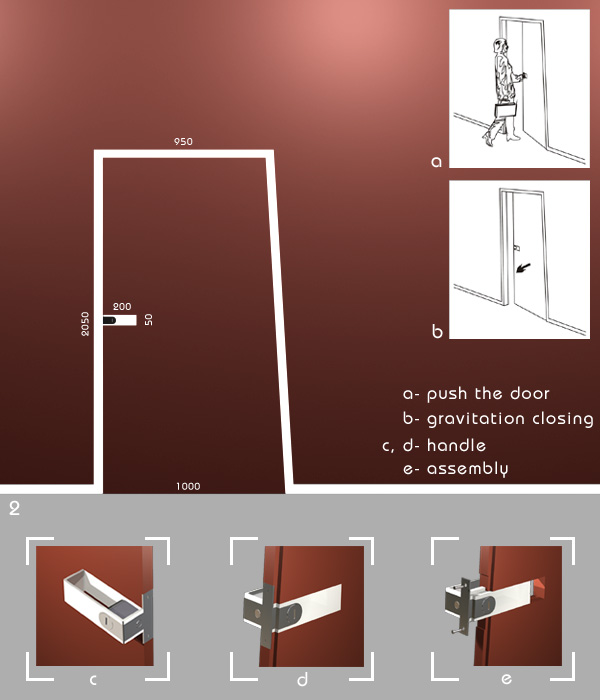
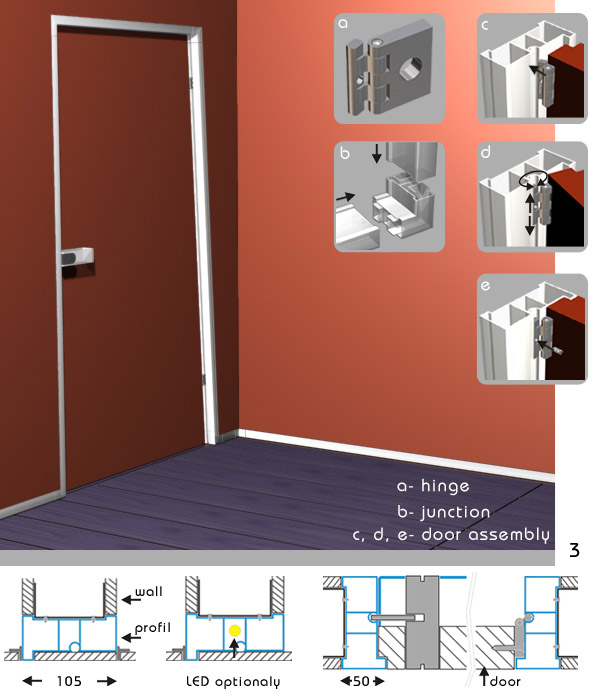
my "lightning" project breakes stereothyp of a typical door. outdoor wiev shows, a door as a surface plained to a wall in the same colour. flat, semi-translucent handle looks like a symbolic icon, giving an information where to push the door to open. brightning endless ribbon going through walls mark out a door position. the ribbon looks like a drawing subtelly emphasize space between two accommodations. the wall slat and the door frame as a one part is made of semi-translucent extruded polipropylen or policarbon profile. thanks to it, light goes by the wall ribbon and shines the profile. it gives possibility to easy estimate situation on the other side of the wall, eg. the ribbon shines, someone is in the bathroom. the door is sloped at hinges side up to 3 degrees to close it automaticly by gravitation. to avoid a risk of danger the door should be made of light materials like eg. ceel-boards.
lightning 1
 lightning 2
 lightning 3