light thin by linh vu falh from china
designer's own words:
i wanted something very light and sober for the Moleskinerie. As the blog has it's own identity, i wanted to do something not very related to the brand itself but still with something simple and beautiful. This logo is easy to use for the web and very light and sober.
logo
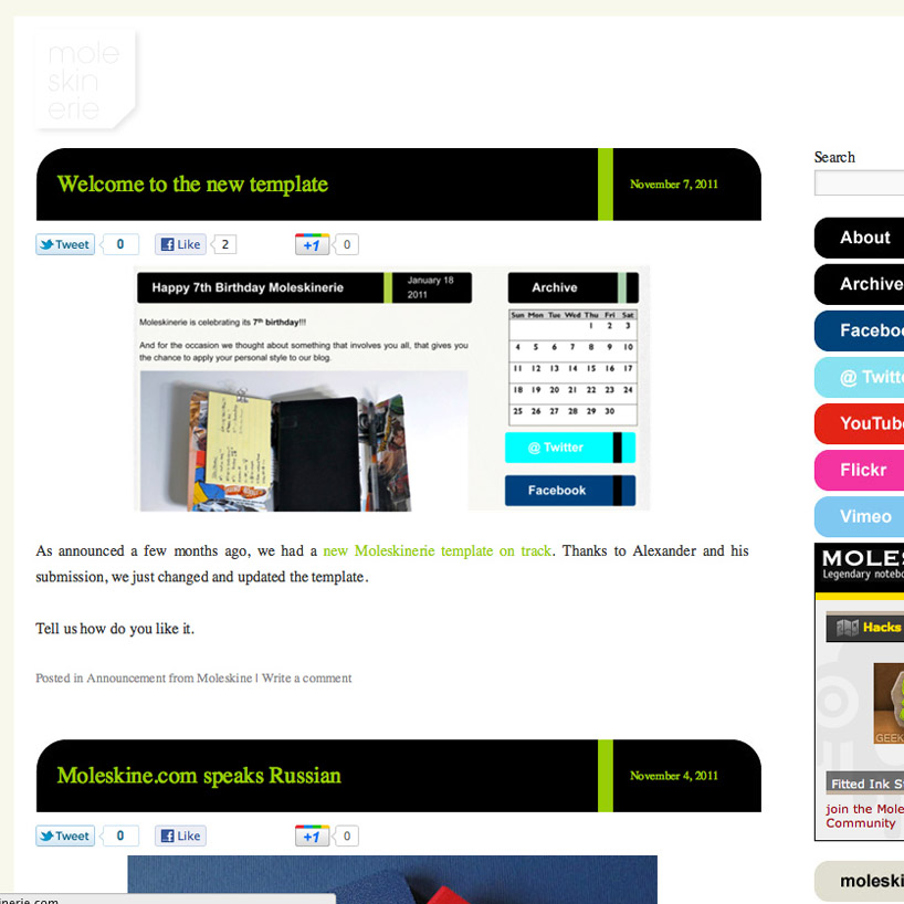
 screenshot
shortlisted entries (2162)