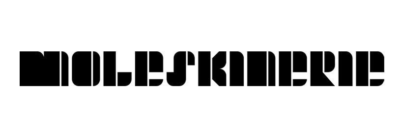
Letterskine by carlos bonet abad from spain
designer's own words:
how to design a logo that must include a long word such as "moleskinerie"?
adding a drawing to the word would result in a too complicated solution. a logo needs to be visually powerful enough yet simple. the word "moleskinerie" should be the logo itself.
a moleskine is a very recognizable object: rectangular, with right and curved corners and the distinctive elastic band. the typography developed keeps all these features, so every letter resembles a moleskine notebook. black is the main color, but the logo can be displayed in any plain color different from the background. another possibility is to use only the letter "m", to have a reduced and more abstract version, to be used for example as an icon.
black on white
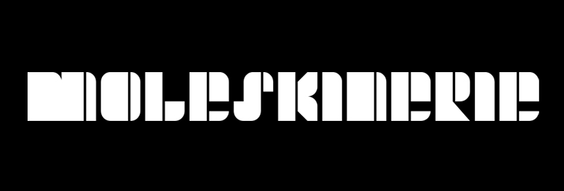 white on black
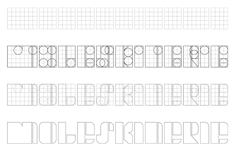 geometry
![]() icon logo
icon logo
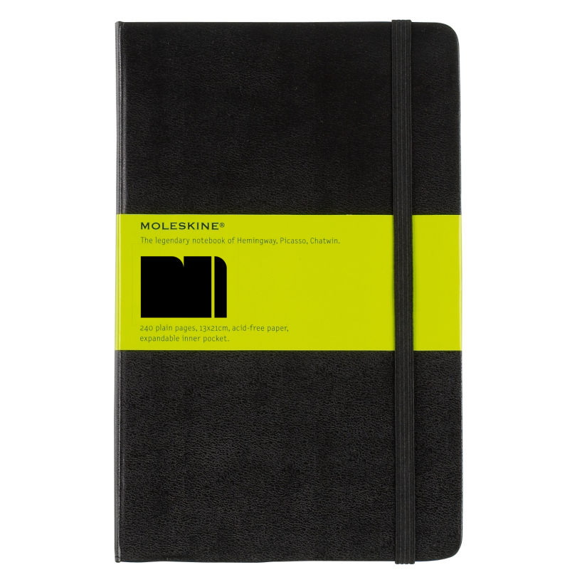 logo on a notebook
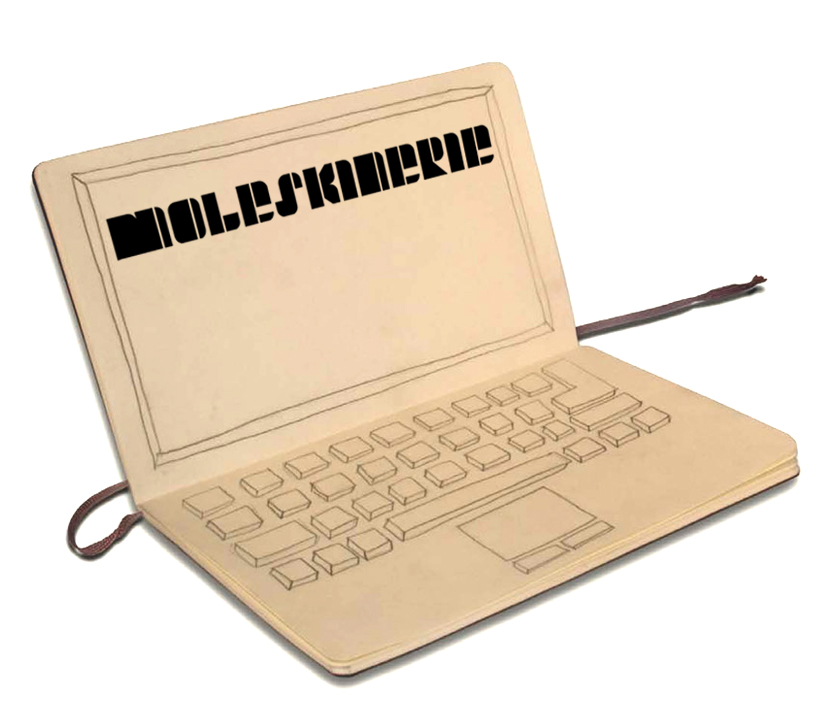 logo on a “screen”