LETTERS FORMING A LOGO GIVING BIRTH TO AN ICONIC BRAND by pareshanand acharya from india
designer's own words:
'Nature is called simple'. The logo designed is 'simple & innocent.'
As the brand name was too long, an attempt is made to work out a combination of letters used in spelling MOLESKINERIE to form an icon.
It wasn't difficult to workout a new & stylish font. But when the name is too long, it is less impressive to grab the attention of consumers to looking to the crux of the letters and recall.
Nature is around us delivering simplicity and so the icon is made of simplest meaning of nature - FREEDOM preaching Strength, openness, flexible, innovative, pure, faith, beauty and wellness.
The logo shows a flying bird showing a growth and progression to the ‘next level of success’. The logo appears to be lively, flexible and energetic to serve the target consumers & also to adapt to the trends (to convince the newer generations or new audience). The form is simple and easy to understand . Moreover letter M & S are emphasized followed by other letters of Moleskinerie . The letter M is capsuled in a circle so as to reveal that the quality & brand character is: controlled, systematic, ethical, age old experienced and to feel the depth through generations.
The thought process was that, ' how do we make the brand iconic ?'. How do we help the consumer to recall and relate ? How can we show the depth of our experience and how we grow delivering the best ? The answer was to make it simplest possible.
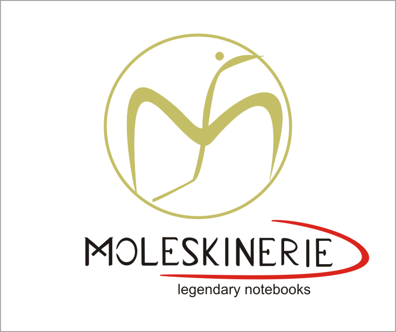
LOGO WITH LOGO TYPE
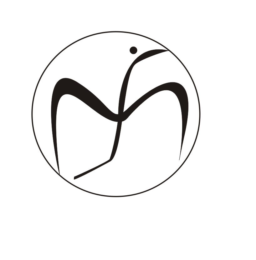 LOGO ICON
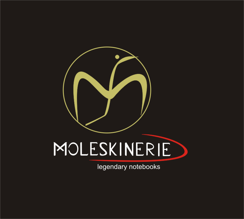 LOGO ON DARK BACK GROUND
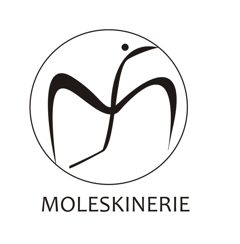 LOGOTYPE OPTION
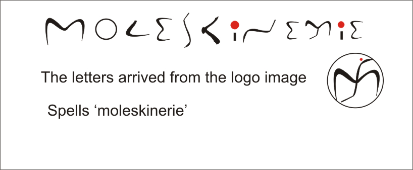 LETTERS FROM THE LOGO
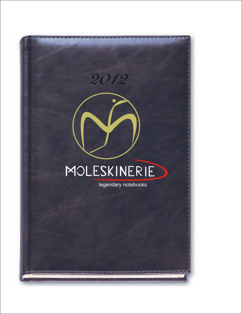 LOGO IMPLEMENTATION ON DIARY