letters by Dani Suriname from usa
designer's own words:
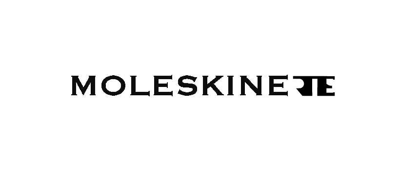
Moleskinerie, the blog, is an extention of the Moleskine brand.
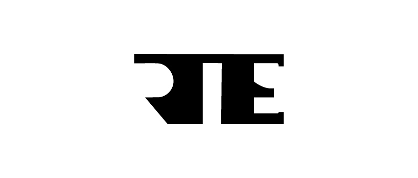
This proposal shows an extension of the main logo and not the criation of another one, that could, eventually, override it.
Thus, this proposal does not hide the elegance and the timelessness of the Moleskine logo. Rather than that, it adds criativity and loveliness - features of the moleskine lovers - through an interplay between positive and negative space of the letters: 'rie'.
lettering
 logo
logo
shortlisted entries (2162)