less is more by arianna loi from italy
designer's own words:
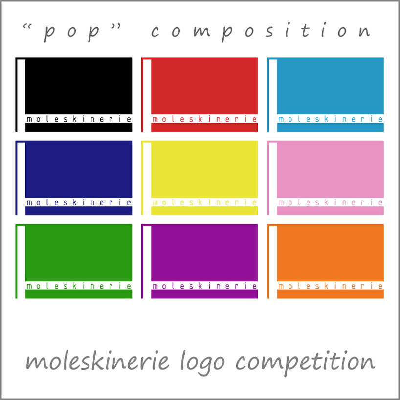
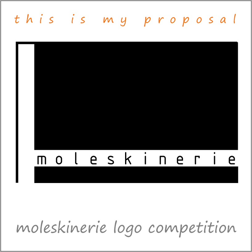
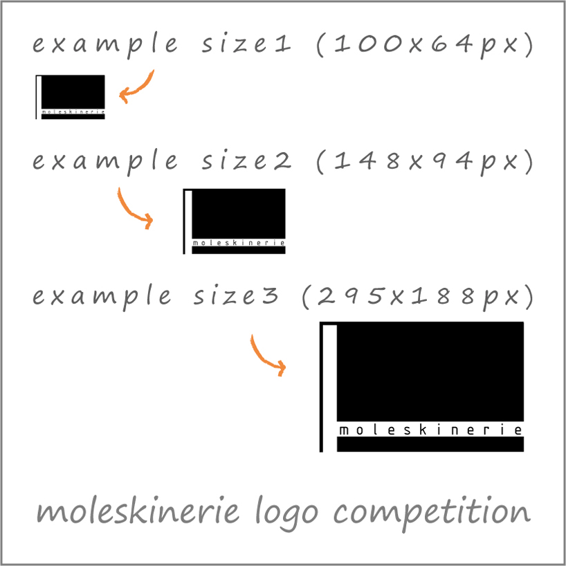
my idea for this logo is based on a one-coloured graphic with integrated text, that plays with a synthetic representation of a moleskine in which the wrapper is the text. this proposal is very simple and recognizable at the first sight. this pop-representation works in small and big size in entire palette of colours and can be used on whatever background.


shortlisted entries (2162)