legendary blog by veiko klemmer from estonia
designer's own words:
1) Moleskine is a brand of travel notebooks
2) Moleskine has a new blog. Consisting of news and examples from distinguished Moleskine users.
3) For some unexplainable reason you want this blog to be different from your brand image - thus you need a new logo for it
4) Your current "Moleskine. Legendary notebooks" is too "sophisticated, mature and classically solid" to fit in the mindset of your typical "loose, hip 'n cool" tweeny (12-36) costumer? You need something more "cute or even childish"?
5) Therefore the new logo has to be colorful, fun, engaging, characteristic and fit to the new blog layout ?
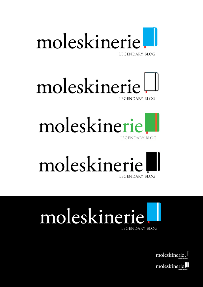
6) Why not a colored up profile (with a bit of tongue-in-cheek humor and some "smooth" edginess )of the thing you are really about - the outstanding notebook with a bookmark and wrapper? Too simple? Here's the secret - a logo a product is not. If you want to sell "cuteness" then maybe you should start making teddybears. If you wan't people to instantly recognize the logo and associate with it further, then use a sign they already know - the profile of your notebooks
7) Kind of self evident, come to think about it, right? :P
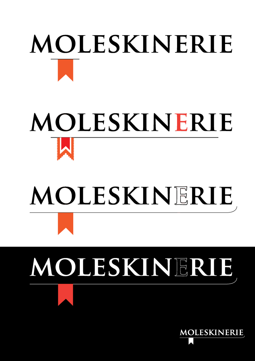
8) Here are my two versions on this theme.
legendary
 smooth