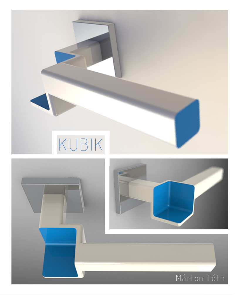
kubik by marton toth from hungary
designer's own words:
the design is about the conflict of positive and negative bodies. the basis of the design is a simple, rounded, rectangular handle in glossy white color. however the shape of the handle is dominated by a negative cube, which is located at the turn of the handle bar. the result is that the otherwise simple handle gets more spatial. the shape of the negative cube is emphasised by it's vivid color, making the absence of the missing part striking, and easily noticeable. the edges where the colors meet stay sharp, the rest are rounded, making the contrast of the negative and positive forms even more markable. the color also gives the handle a sense of playfulness.

shortlisted entries (4078)