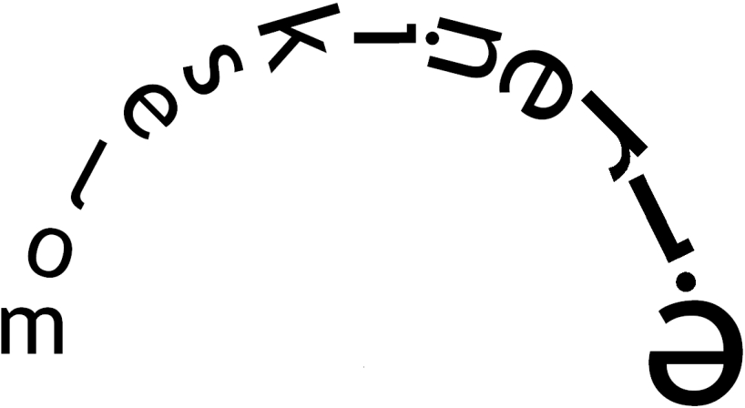
just open it! by ivan mladina from croatia
designer's own words:
the logo is inspired by the motion of opening a moleskine notebook and its amazing versatility. there were two principal conditions behind the logo design - it should be dynamic, elegant and display-friendly, yet plain and humble, remaining true to the simplicity of the original moleskine notebook. simplicity was achieved using a simple, widespread font.
dynamic motion was achieved by rotating the letters arount the center point, increasing them in size in the process. that way the last letter "e" is turned upside down, its upper (now lower) part mimicking the contour of the released gum strap.
the logo uses a trebuchet ms font, although it works well with most other common fonts.
shortlisted entries (2162)