japi moleskinerie logo competition proposals by jaime erice toran from spain
designer's own words:
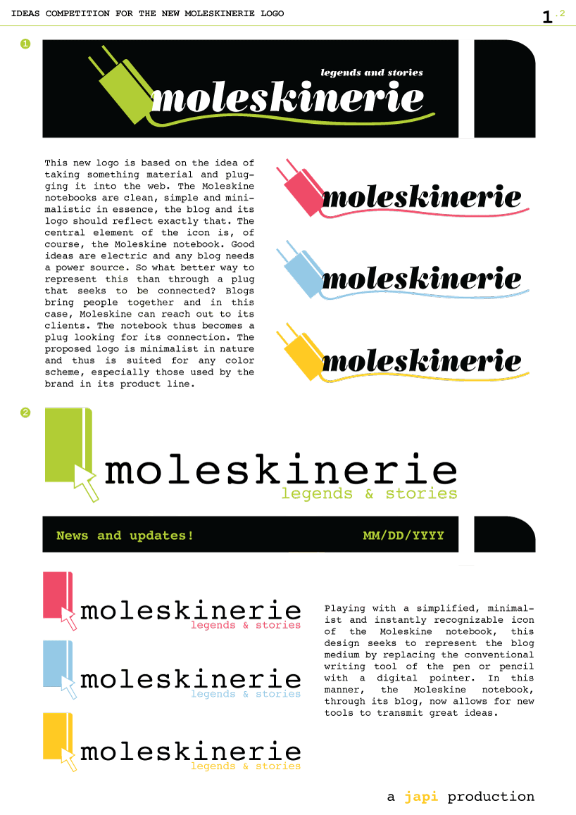
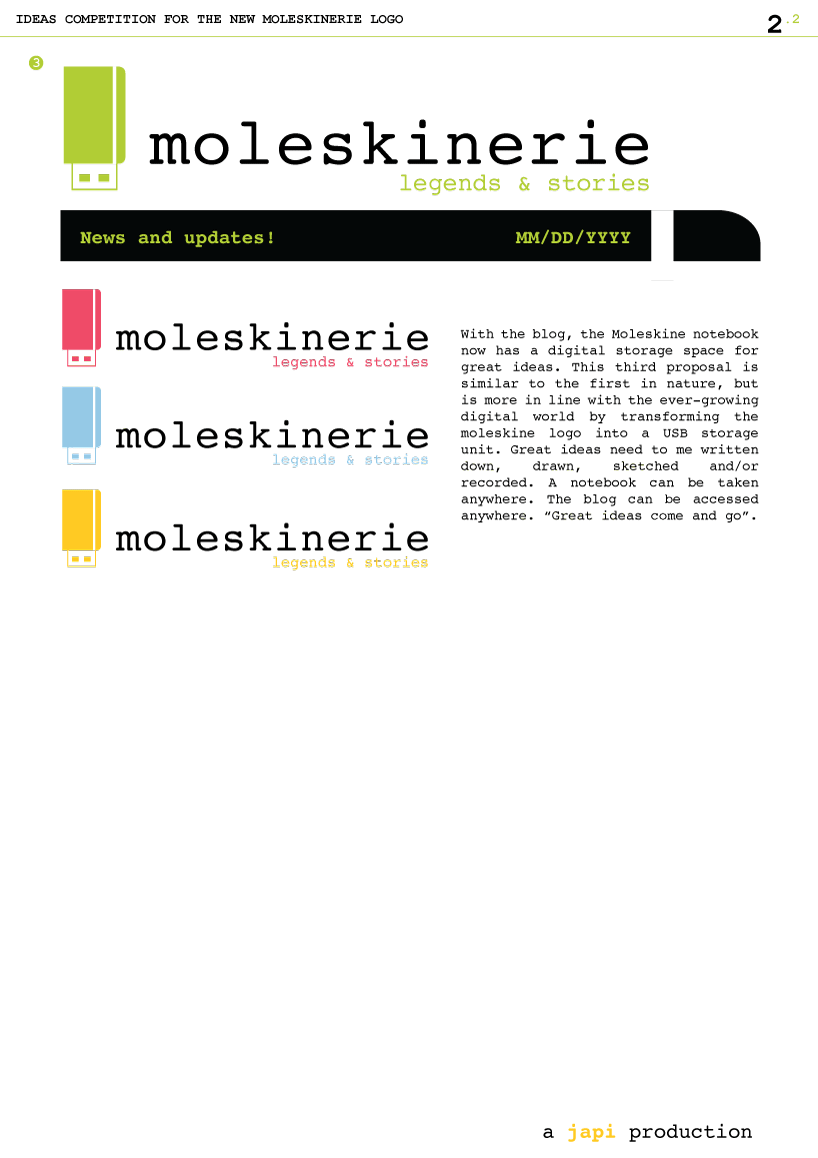
a fun attempt to design the new logo for moleskinerie.com, the new blog for the notebooks we love and use every day. we designed three new logos by first sketching out our ideas in our notebooks, then picking our favorites and finally bringing them to life with adobe illustrator. the three proposals are independent yet they share a common origin: a minimalist, instantly recognizable icon representing the moleskine notebook takes on elements from the ever-changing digital world to become a single image.
first and second proposals.
 third proposal.
shortlisted entries (2162)