in a line by lana lovric from croatia
designer's own words:
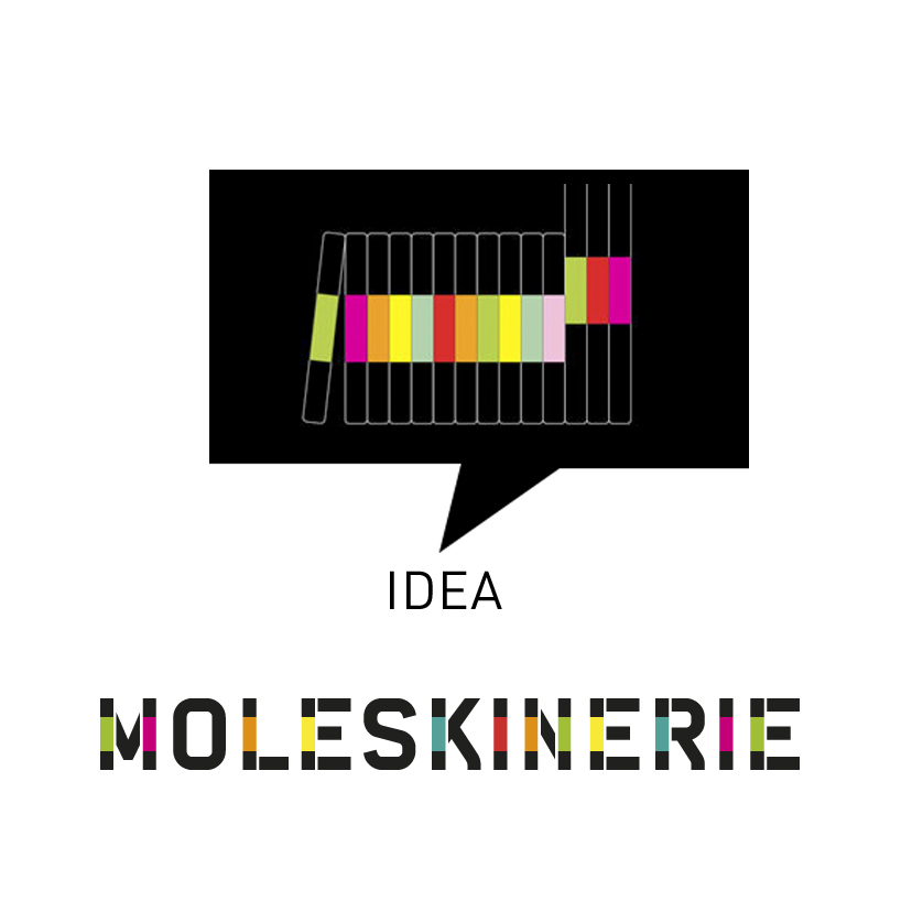
logo design is based on moleskine main product - notebook. the construction of the typography of moleskinerie blog logo was very inspirational, having letters with straight lines. those straight lines were used for imaging those notebooks standing arranged on a bookshelf. logo is text-based: simple and very identifying. in general, the solution follows the brend's simplicity of forms and potency of pure colors.


shortlisted entries (2162)