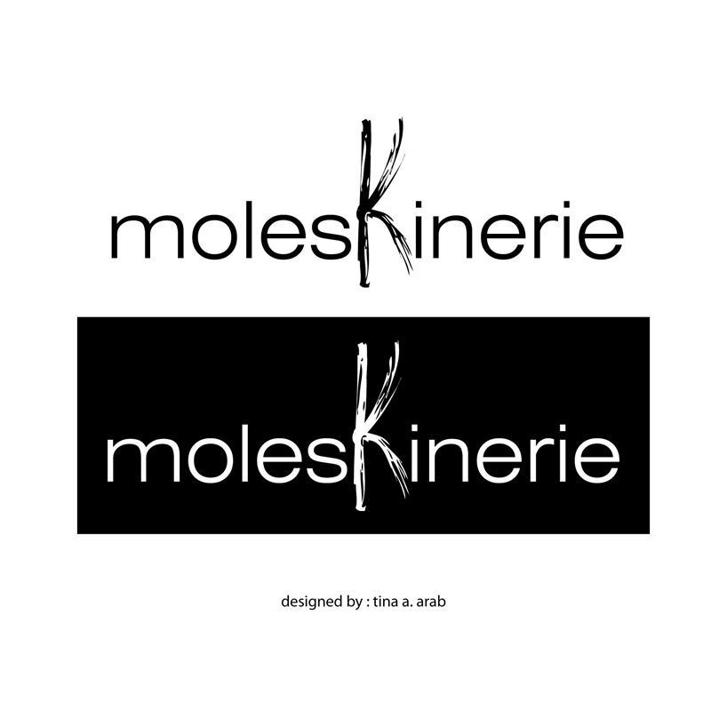
imagine by tina arab from lebanon
designer's own words:
the basic idea of my disign lies in the letter ( k ) ,that in its shape is very similar to an open sketchbook turned sideways .
in this logo the letter k ( the sketchbook) is sketched unlike the rest of the letters, for a sketchbook, unlike digital memo’s, allows you to sketch ideas in a creative and personal way .
the typface used in this logo is : swiss 721 light extended, light .
logo black and white
 logo color
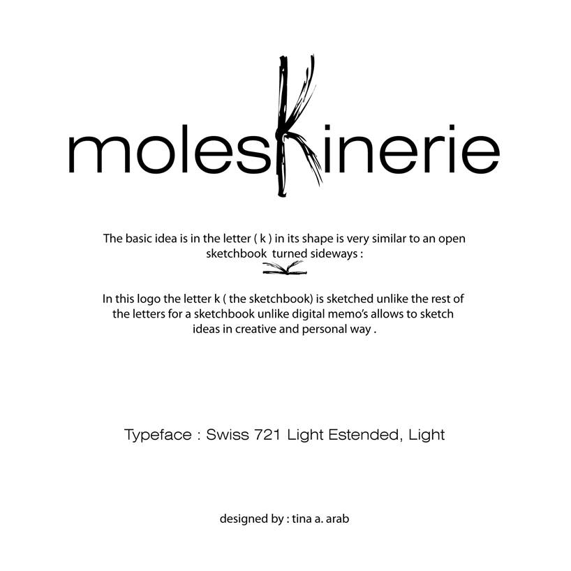 explination
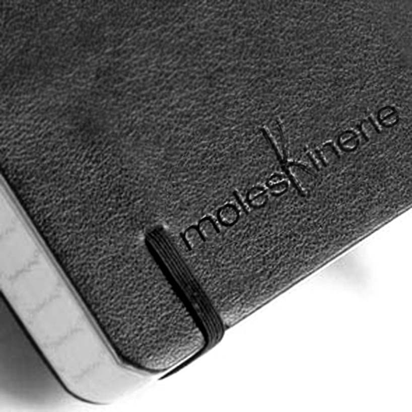 on notebook
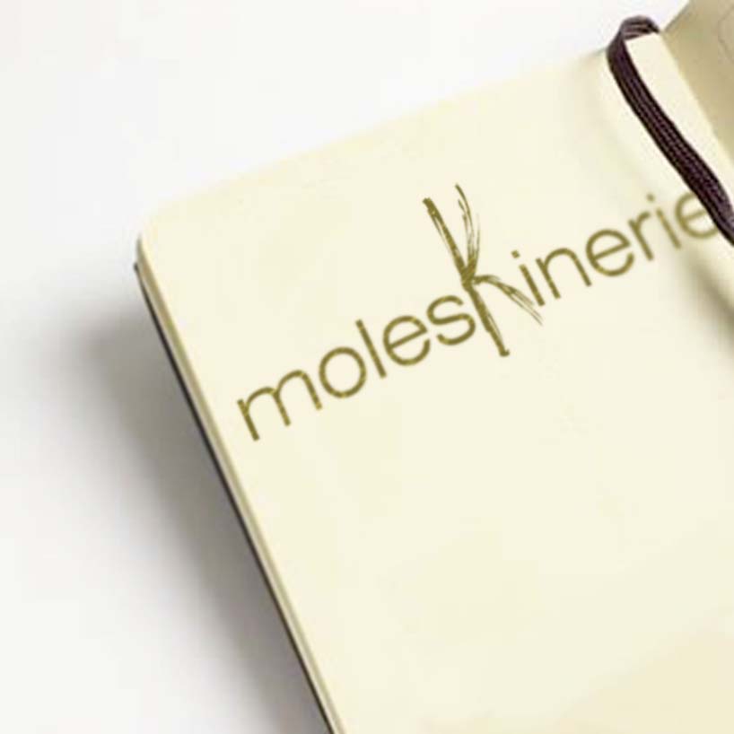 on paper
shortlisted entries (2162)