i mark exhibition by jasleen manrao from india
designer's own words:
BACKGROUND
India design mark (i-mark) is a part of internationally recognised good design movement. An initiative of the India Design Council, G-mark from Japan has played a guiding role in the initiative. Each year Product Manufacturers and Design Centres across the country, send in their entries for evaluation. A Jury panel comprising of noted professionals, evaluate the design holistically. Entries that showcase excellence in design and meet the jury criteria are awarded the
i-mark. The Jury process is a two-stage process. Stage-2 requires the products to be displayed for testing and critique. The awarded products are showcased for two days to general public.
BRIEF
The exhibition showcases good design, therefore we let the brief remain 'simply Good Design'.
92% REUSABLE, 7% RECYCLABLE, 1% PERISHABLE
Exhibitions, typically generate tonnes of unwanted material as waste. The design at inception looked at minimizing waste. Most products were to be used in unaltered form. Cutting, nailing, gluing were eliminated. While on one hand, this ensured that the materials could be re-sold in the market at MRP, hence eliminated dumping. Corrugated Sheets, Carpets and Metal supports were used in such a way that they could be recycled/ reinstalled later.
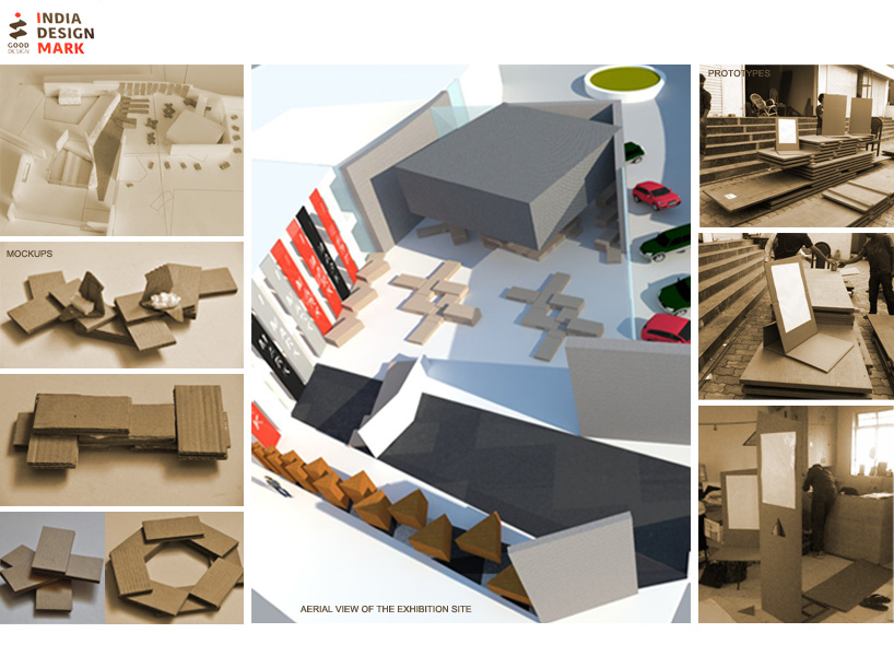
On the other hand, the constrain gave birth to a variety of details: tying with rope, interlocking at ends, corrugated spacers etc. Gravity was used as glue to bind 32mm plywood sheets. Simple weight transfer techniques resulted in sculptural forms. The products ranged from SUV’s to medical syringes. The forms were developed in such a way that even though there was a wide variation in the sizes of products, each product got its space as per handling/ display needs. Iconic G-mark exhibits from Japan were displayed in their own special nook.
Furthermore, the exhibits were spread-out into clusters. The exhibition was curated in such a way, that there was something for everybody in a cluster, thereby avoiding visitor fatigue.
USER_EXPERIENCE
Over 2000 people visited and interacted with the products in the two day period. The exhibition and the environmental graphics worked towards spreading awareness about Good Design. The triangular panels in the i-wall, shall now travel to different venues to spread the message further …
Zoning & Prototypes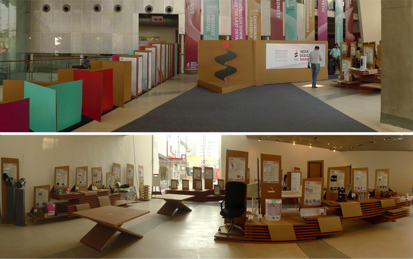 The entry and the displays
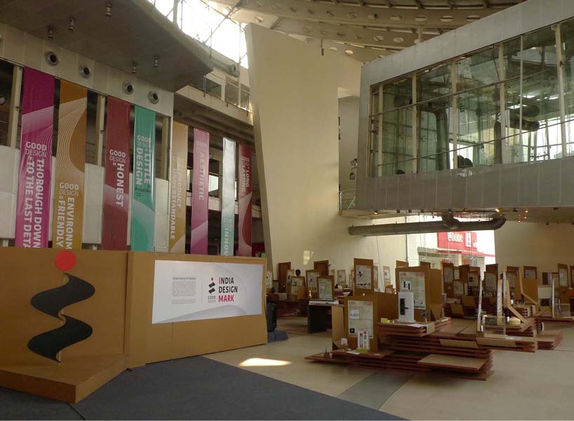 i wall
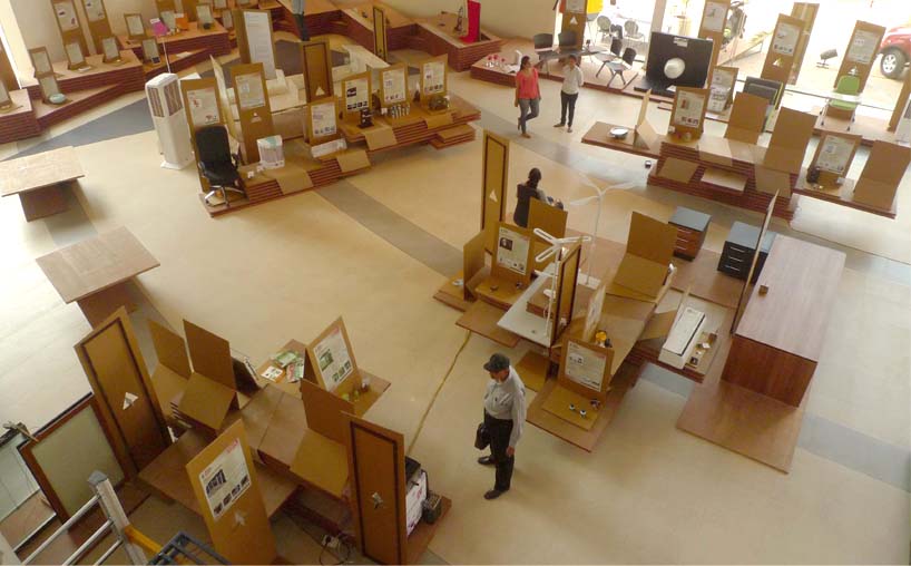 aerial view
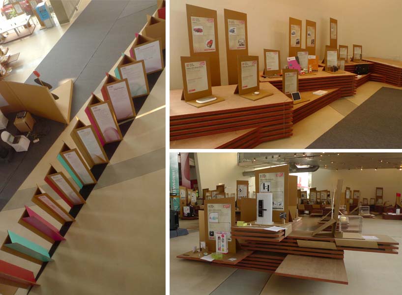 Various display clusters
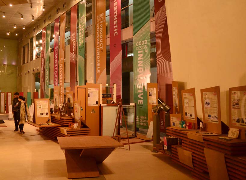 Evening view