harmony by Luca Caputo from italy
designer's own words:
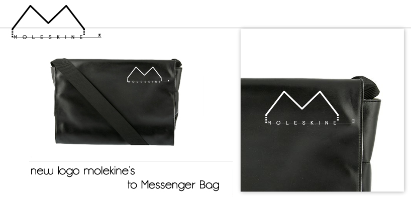
The logo is a simple gesture and adaptable to all types of application. Edited version of black / white style moleskine to be applied to each product.
The background of the logo necissita of attention as the logo would fit it anyway. The logo is designed, in terms of the application process as an incision inside the hardcover, which recalls the sign of an incision in their limbs the most significant artists.
Its color is also materially different from the cover as shiny.
The new logo moleskine, a new identity for an ancient legend.
Messanger bag
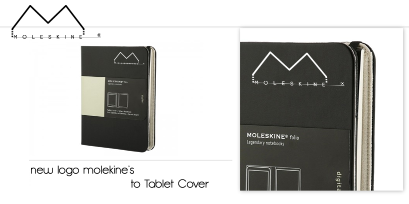 Tablet Cover
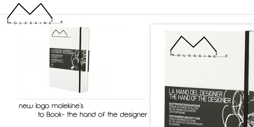 Book
Book
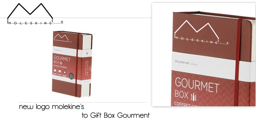 Gift Box
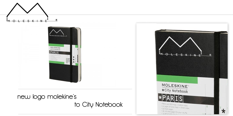 City Notebook
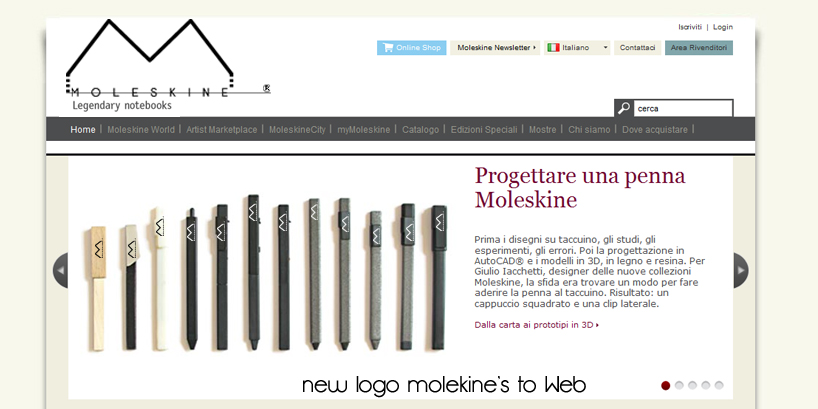 Web
Web
shortlisted entries (2162)