Gustavo Cordova pages logo by gustavo cordova from usa
designer's own words:
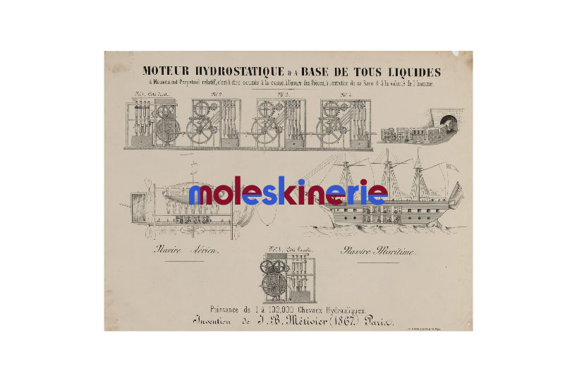
cut up typography is the focus of this logo. each shift in color references the idea of turning the page of a moleskin. subtlety of execution is a strong focus of this identity the reiterates some of the core values of the moleskin. the variance in color expreses the new creativity found in each page. the sketch imagery reinforces the idea of intellectual as well as creative pursuits.
single logo
 logo scaling comparisons
 color exploration
 logo on Tshirt
 logo infront of imagery
shortlisted entries (2162)