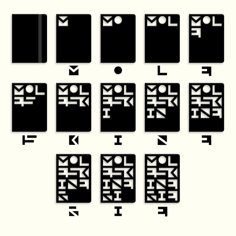
full & blank space by jose manuel otero from spain
designer's own words:
the design proposes a visual game that occurs when you use shapes that our brain tries to identify when placed in the empty or full, as well as the concept of use the notebook in which the user sometimes used personal codes of writing or graphic signs that only he can interpret.
starting point logo, is the well known the black cover of Moleskine notebook, on it, we cut along a grid typographic forms to complete the sketch.
at first it appears, is a seemingly unintelligible code until our brain seek and find the meaning and order in interpreting the message hidden design "moleskinerie."
finally dispense with the shape to stay with background and move from empty to full, positive-negative space.
as regards color, this is reduced to its use in the letter "o" as a visual focal point, with differences by use of the logo, making it very versatile and functional for multiple platforms and media.
logogenesis
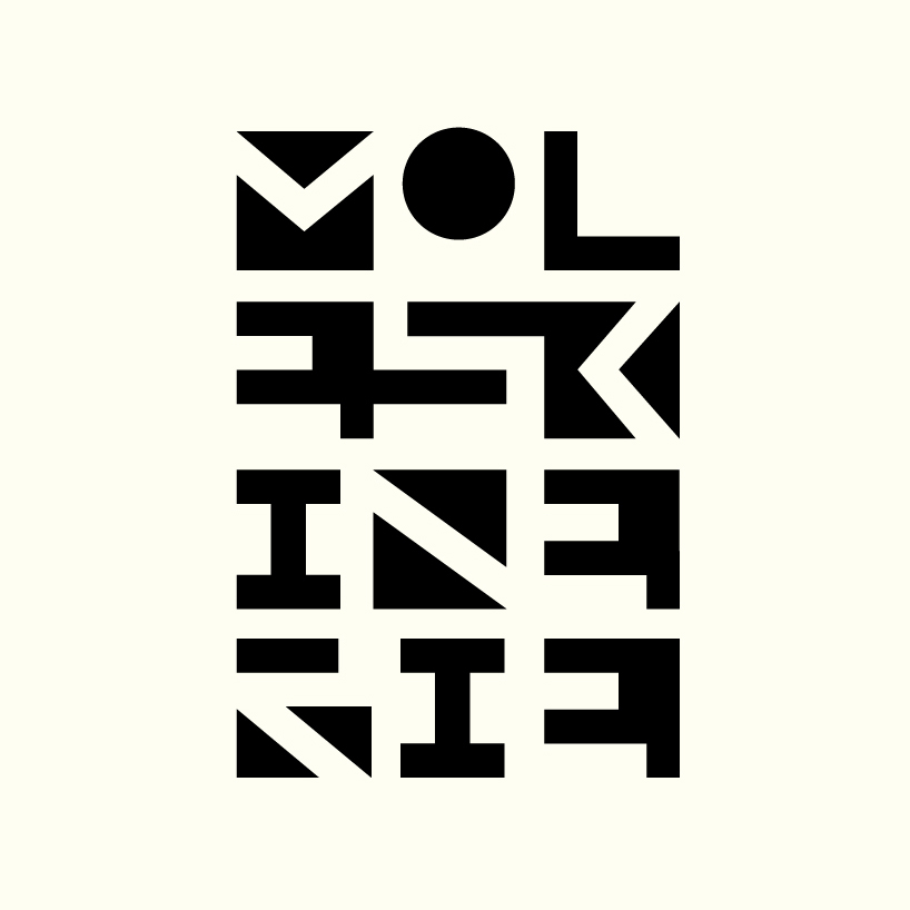 logo bn
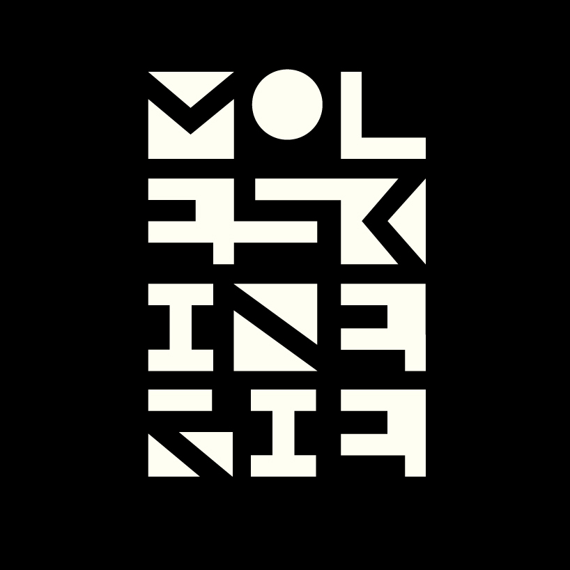 logo in negative
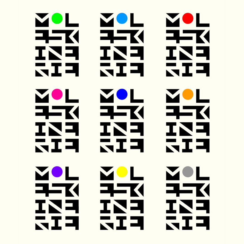 variations logo color
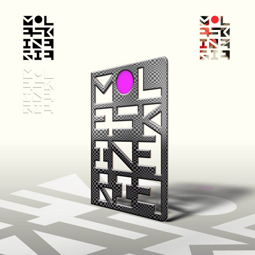 free applications logo
 applications media logo