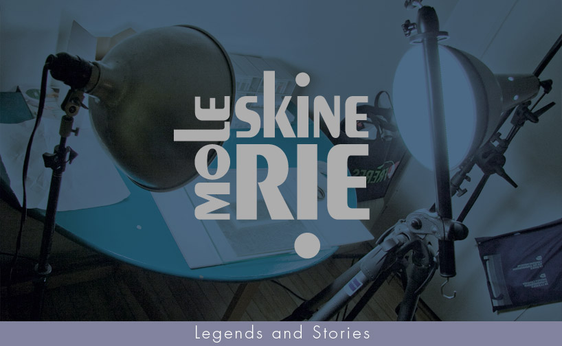
Frolicsome! by lafrance claude from canada
designer's own words:
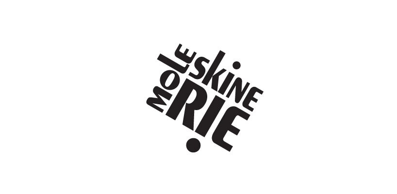
I tried to create a unique and playful logo, using typography only.
You see it once, you never forget !
Since the original Moleskine logo is based on Cooperplate, I used an other classic font, the Peignot, created by Cassandre in 1937. By splitting mole-skine-rie and playing around with the type, I created a rectangular bursting form which is dynamic and very readable.
It looks great on different backgrounds, in black or reversed type, embossed, filled-in and even upside down. It can be used straight and it can also be tilted (-30°). I would suggest to use it freely and not compel it to a unique color.
Because of it's strong visual identity, it is always recognisable in any position or color.
Thank you,
claf
Logo & slogan
 -30°
-30°
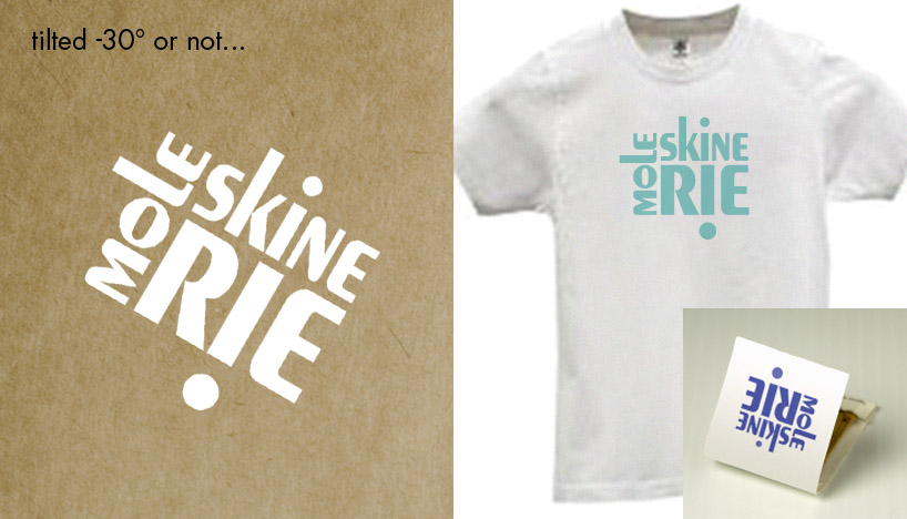 tilted or not ?
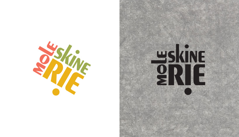 color and black on texture
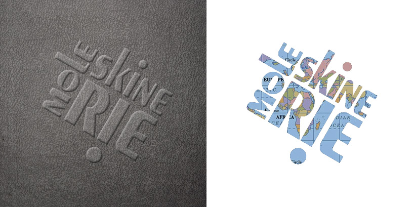 embossed and filled-in
 big or small