four out of four by narek bavikyan by narek bavikyan from czech republic
designer's own words:
i tried to make a logo, interesting in detail and balanced as a whole.
goal was to make practical to use, visually balanced and attractive object. i think i got it.
logo is based on font family by adobe.
intro
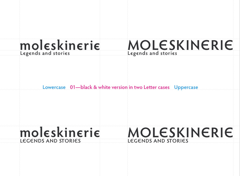 b and w
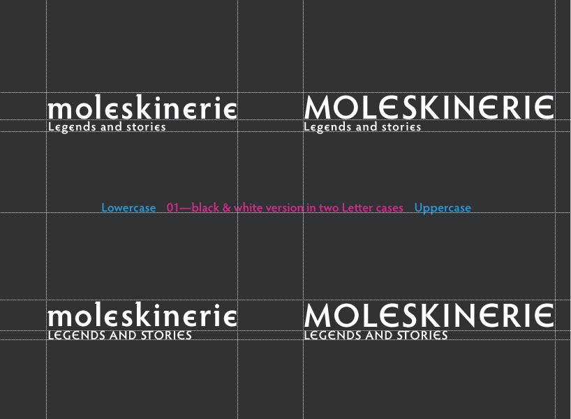 b and w inversion
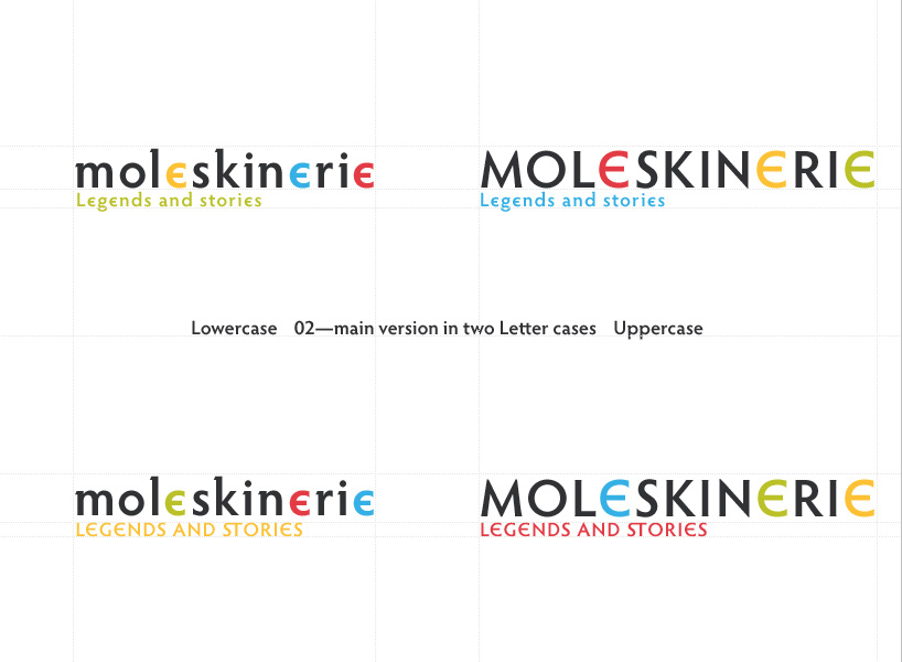 main
main
 main inversion
 outro
outro
shortlisted entries (2162)