flying & sharing by sonia castro alonso from spain
designer's own words:
flying & sharing stems from the observation and compillation about the trade mark moleskine, the moleskinerie blog and their diverse broadcasting channels, that is, The project arises from the visualization of a considerable number of images, videos and texts as a contextualization of the same base.
considering this first phase, the work begins both on paper and on screen, transferring ideas and images in both media continuously. terms spread out from this process, that are the main pillars that give name to the project: flying & sharing.
in the three chosen choices there are some features in common: in first place, the logo made up of text and image looking for a balanced visual finish. in all of them i repeat some features, in one hand the representation of an open book, keeping in mind the moleskine line details like the rounded page corners (logo 1, 2 and 3), the presence of the side closing rubber (logo 3) or the consideration paper that covers the notebooks (logo 1 ); and in the other hand, there is the presence of the arrowhead, whose purpose is the link within the digital world and the idea of sharing.
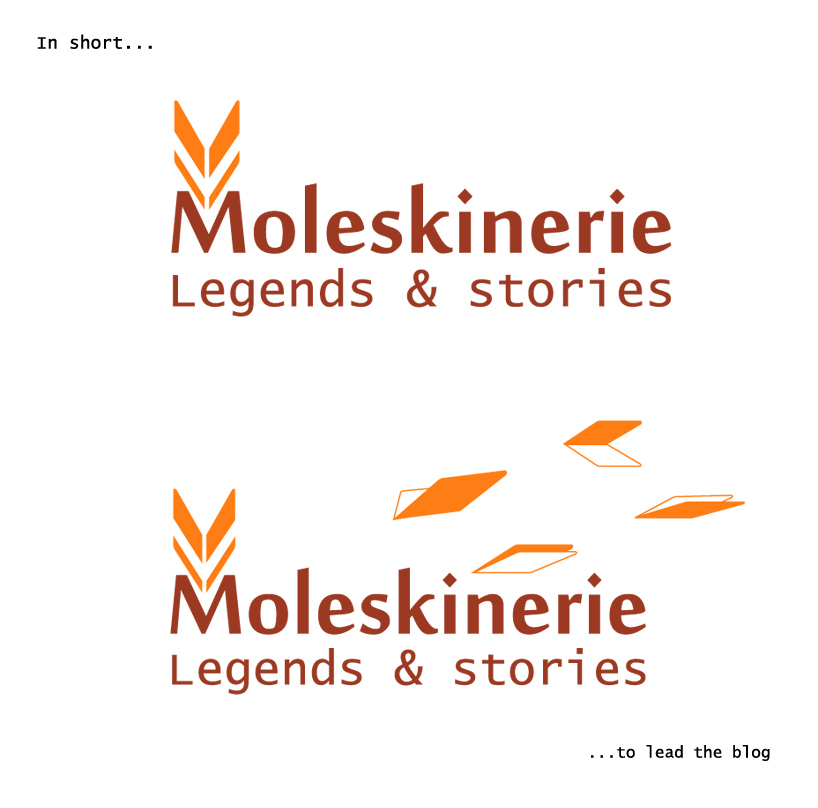
it is important to point out that the representation it’s the open notebook, to indetify, at the same time, the notebook and the arrow; or like in the logo 2, to manifest and open notebook spreading his covers preparing to fly and carry the ideas.
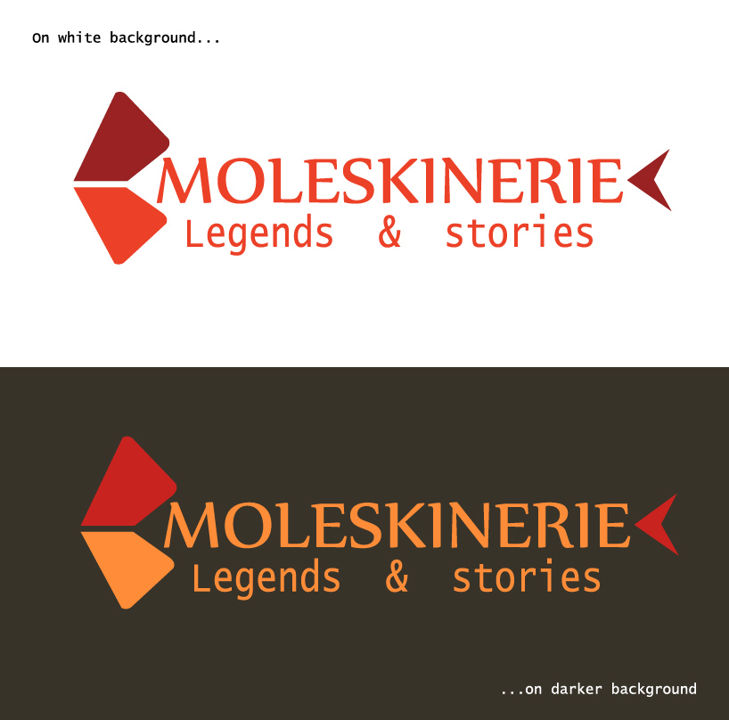
concerning about the colour, i had chosen the utilization of the warm range in both logo 1 and logo 2, trying to refer to the great books that keeps important legends and stories, also seeking to convey a feeling of trust and closeness. however, in logo 3, exists a variation with the introduction of a cold colour to have a contrast point within the project.
and finally, concerning about the typography election, both in logo 1 and logo 2, its because the configuration provides a carefree and fresh point without losing the elegance. however, in logo 3 i kept the moleskine original one, because it gives a characteristic touch and typical from the mark.
f&s logo1
 f&s logo2
 f&s logo3