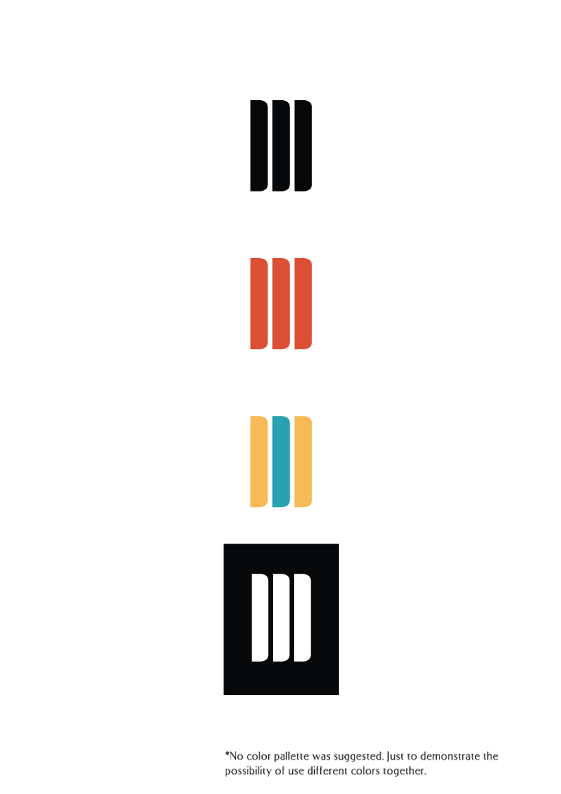
Flip/Browse by fabio liu from brazil
designer's own words:
the process was started thinking what was the main subject of a blog: daily posting, of course. but sometimes you miss some information and browse back; sometimes you just want to read that specific post again–just like you do in a personal journal.
and not forgetting the next page: what's yet to be written, the blank page. that was the link: browsing pages just like a blog and a journal.
but browsing in a blog at your pc it's not like to browse through your personal journal. true. but you can't take your pc anywhere with you (not in a practical way). but you do with your tablet, smarphone or any other device with touchscreen technology–and then you'll find pages to be flipped with your fingers just like you do with paper pages.
the other crucial point: the logo must be connected visually to the iconic moleskine journal. that classic black cover, those round corners, the ivory tone of the pages. so I started to flip it quickly and realized that doing this the cover, the pages and the back cover altogether were in a form of an "m". then I checked the blog and saw those blacks entries bar and I thought that was the link.

