fancy moleskinerie by Telmo Julião from portugal
designer's own words:
Seing the Moleskine brand as various products for young creatives such as writers, illustrators or designers, and knowing that a blog is something modern and that requires creativity as well, I decided to design a logo that represents the trend of having a blog written virtually and the work made by hand inside the Moleskine products. So I tried to merge this “modernism” with the classical handmade things. I used a typeface and changed some details of it to make the logo more exclusive for an identity. The lettering for the logo intends to transmit the idea of something new from and to designers. It also represents in some way the characteristic Moleskine bookmarker.
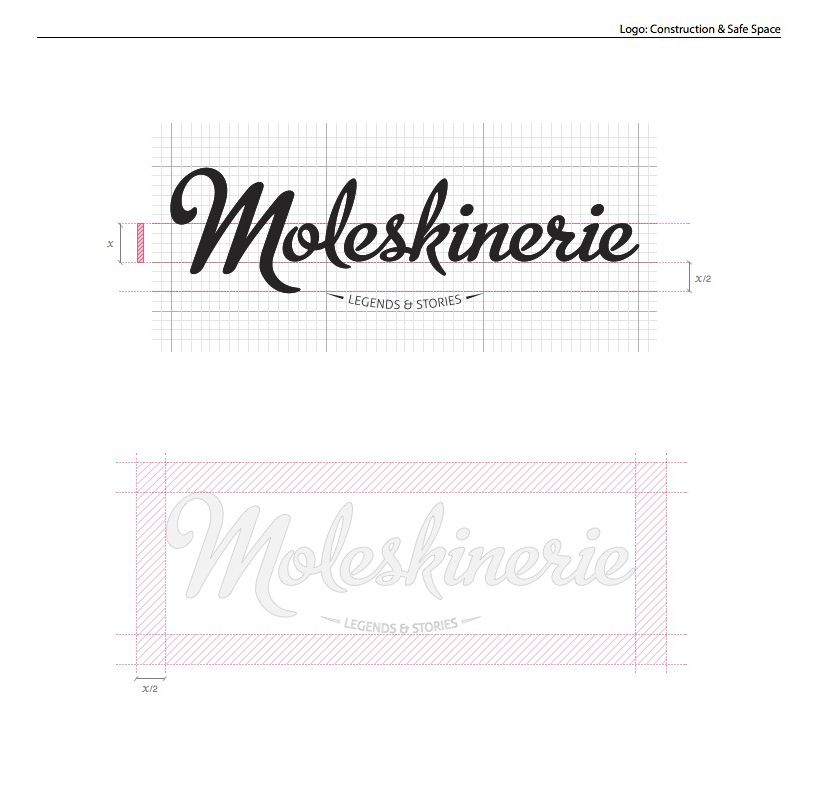
logo construction
 logo scale and versions
 alternative logo
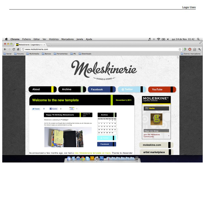
 use in blog
 presentation