explosion of an idea by tina arab from lebanon
designer's own words:
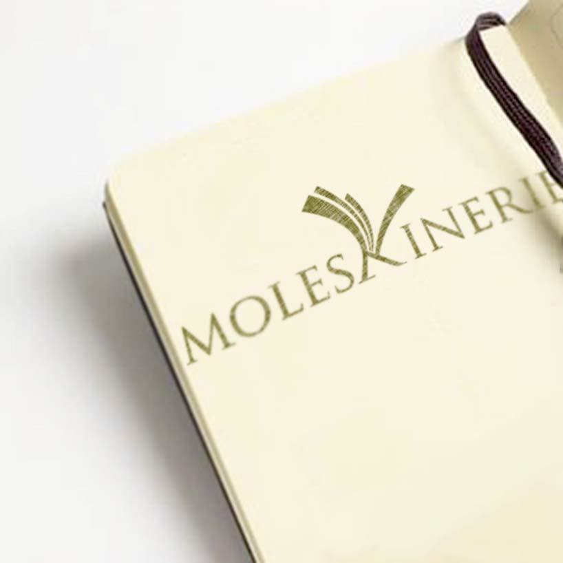
the basic idea of this logo is simple, the letter ( k ) in its shape is very similar to an open sketchbook, also in this logo it is graphically shaped as an explosion for a sketchbook is usually the place where all our ideas explodes whether they were a sketch or a writing and even an appointment .
the typface used in this logo is : trajan pro regular (ps : the typface‘s detailes are edited)
logo black and white
 logo color
 explination
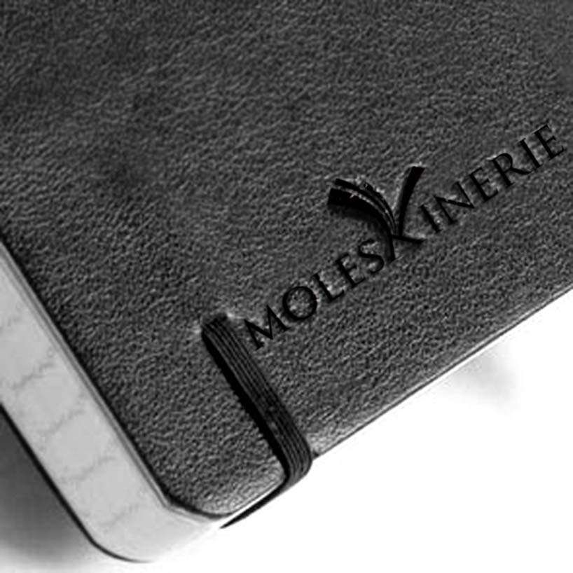 on notebook
 on paper
shortlisted entries (2162)