enter by meta mencinger from slovenia
designer's own words:
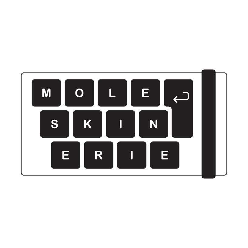
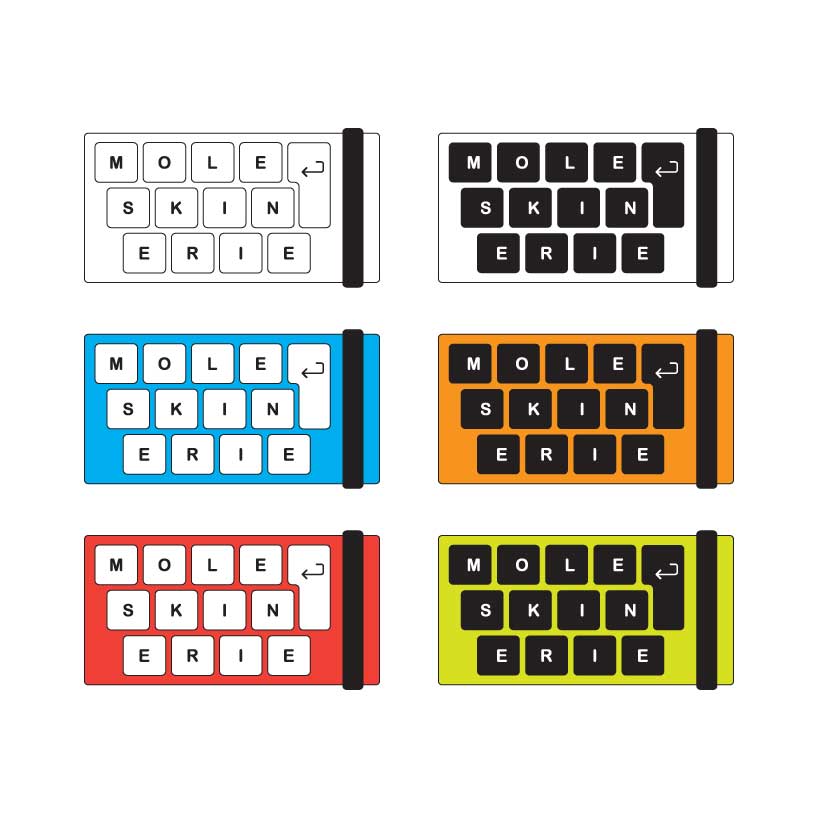
logo “enter” combines the word moleskinerie, a computer keyboard and a typical moleskin notebook look and thus implies the essence of moleskinerie blog. It also takes into consideration the current look and image of moleskinerie. It uses a typical moleskin black and white color scheme, which makes it perfect for any kind of background and also allows application of different colors for special edition occasions as is shown in the provided jpg. files. the logo offers strong differentiation and draws the viewer in with it’s simplicity also playing with the word "enter" by encompassing the key "enter" and therefore stating "enter moleskinerie" and so inviting the viewer to engage in the blog.
logo
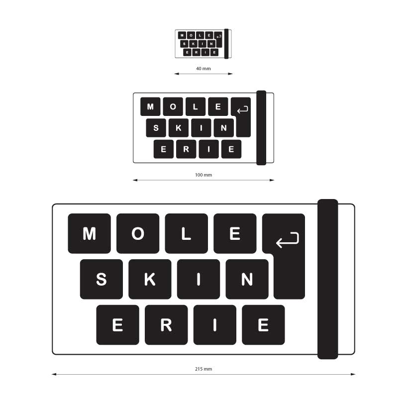
 different sizes
 different colors
shortlisted entries (2162)