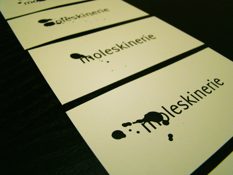
drop of ink by decroos bart from belgium
designer's own words:
the drop of ink, the splatter paint, is a universal symbol of creation, it is the first step in the creation of art. it reminds of the drop at the end of a pen, ready to write the first word on an empty piece of paper; it reminds of a paintbrush hovering over blank canvas, waiting to apply that first stroke.
the drop of ink is a symbol, an archetype, defined not by its form but by what it represents. it can take on a variety of forms and still evoke that same image of creation, of art. it brings to mind the action of creating and that is what moleskinerie is about: creating, filling up blank pages.
by representing itself through a drop of ink, moleskinerie represents itself not by a single defined form, but by an idea, a symbol. the various forms a drop of ink can take, provides the advantage to moleskinerie that it can use these various forms at various occasions. depending on the occasion it can take form as a single drop of ink on a business card, or as a wall completely splattered with paint at a fair. the use of a drop of ink also means that its application is not limited to digital use, it can be applied manually too, resulting in an endless series of different forms carrying the same message; the message of creation.
logo
 variations