digital absurd by monica freundt from netherlands
designer's own words:
The proposal plays upon the juxtaposition of analog and digital media and their aesthetic qualities. The creative industry has been increasingly shifting and thriving in the digital world. Parallel to this phenomenon has been a longing for the analog: the spontaneous freehand sketch – the accidental watercolor spill - and a proliferation of computer algorithms that generate this "freehand style".
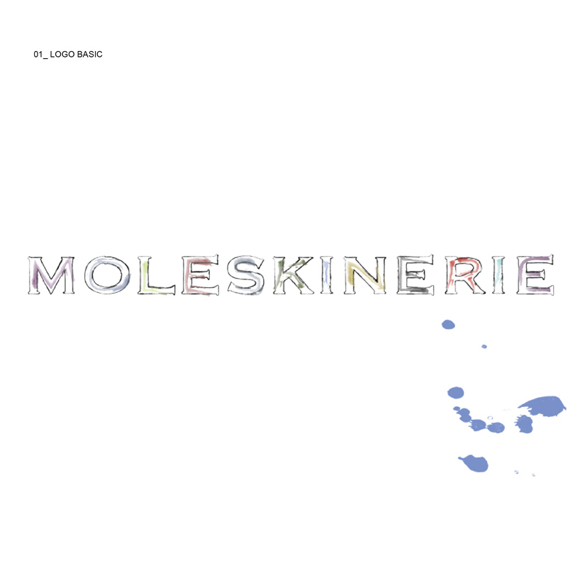
The basic logo (file 01) is a computer generated "freehand" trace of the serif typeface moleskine logo.
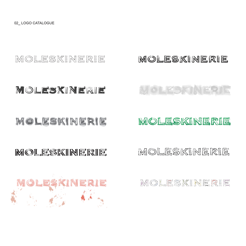
The proposal is a “digital absurd” – it exploits this "love of the freehand" - of the notebook, the trial and error - the sketch - as a computer generated style. The proposal allows for occasional logo variations in case of special events very much like Google does with the thematic Google doodles. Several variants are presented in the "freehand style" logo catalogue (file 02). These could be generated by a basic algorithm that outputs a logo variant in a different looking media - watercolor, airbrush, crayon, marker, etc.
logo basic
 logo-doodle catalogue
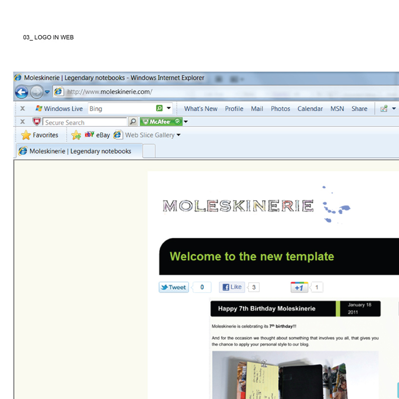
 logo in web