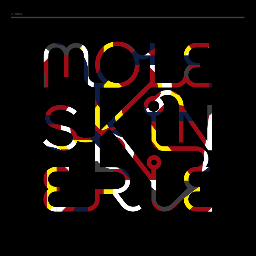
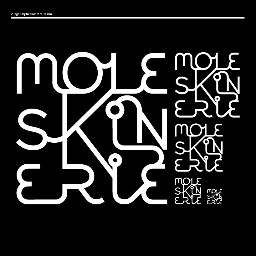
deco by adam gäfvert from sweden
designer's own words:
the logo is created based on these keywords:
classic – the moleskine brand rests on a long and and proud tradition.
people who chooses moleskine do it for the great quality and loves the classic look and feel of it. also, the price for a moleskine is on the upper end of the scale. for these reasons, the logo should incorporate a refined, timeless and classic style.
playful – the molskine is used mostly by creative people. the logo for the moleskine blog and blogs are spontenaus, informal and playful meeting places.
modern - blogs are a fast and modern way of communicating and used by people who wants to interact and take advatage of the latest news and trends.
vector based.
moleskinerie_logo_3_01
 moleskinerie_logo_3_02
 moleskinerie_logo_3_03
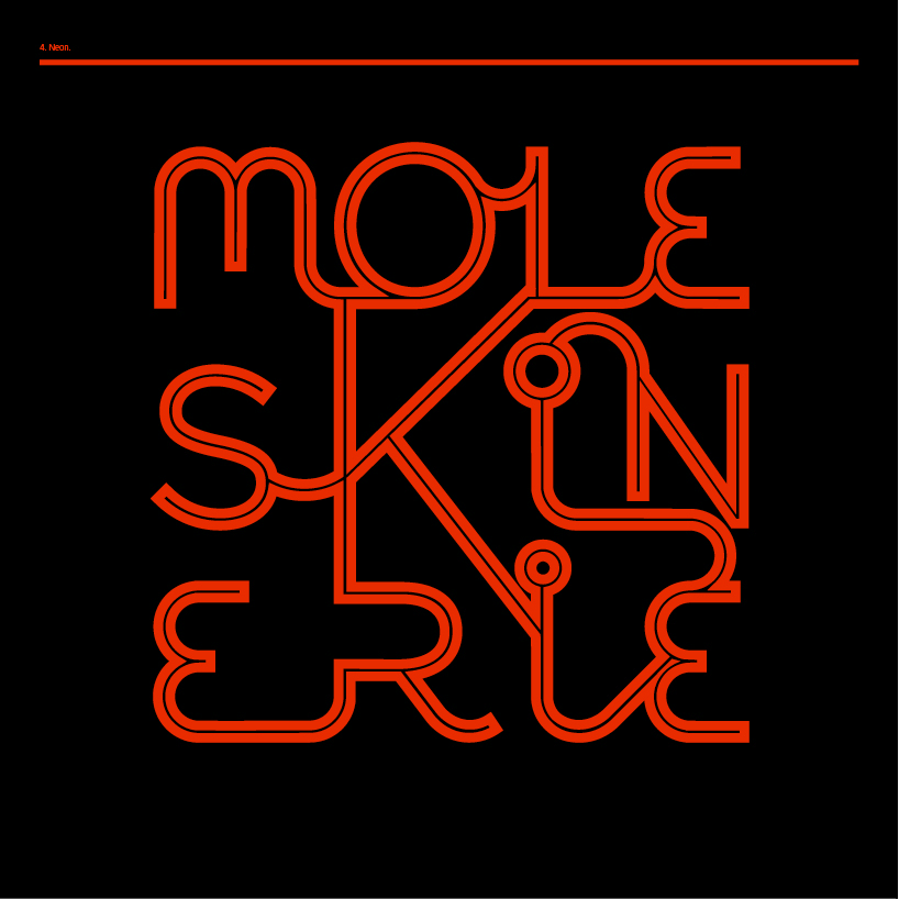 moleskinerie_logo_3_04
