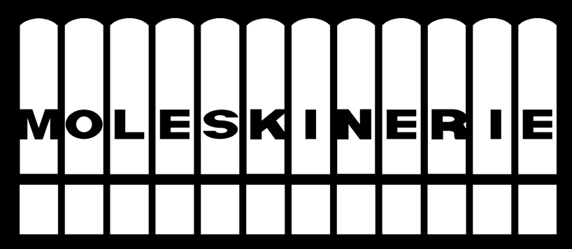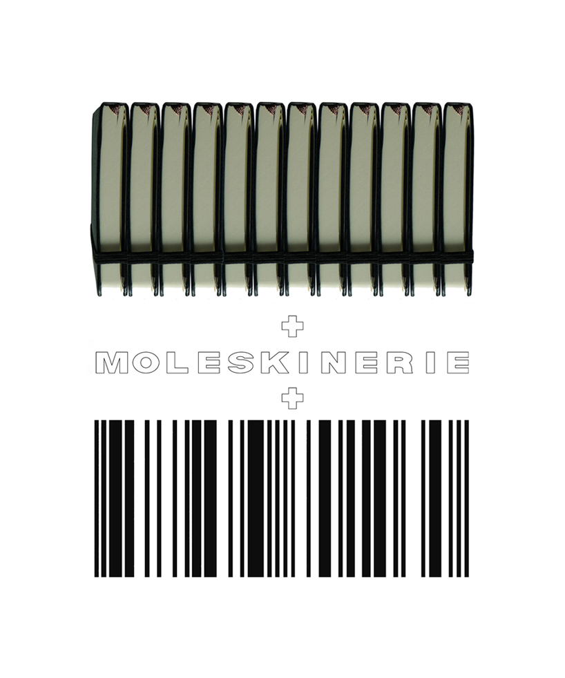
daniela vlahovic_moleskinerie logo design by daniela vlahovic from croatia
designer's own words:
the logo design represents the distinctive and easily recognizable moleskine notebook appearance reduced to the form of a sign. it also flirts with the barcode incidence, which is common to every single thing in our consumerist time and culture.
the requirement that the design should read “moleskinerie” is respected.
it's easily reproducible, single-colour, can also be reversed out in order to work on any background colour or even a photograph.
it’s adjustable to any size from very small to large, with an additional possibility to switch from planar when small to linear when large (containing only two line weights of different frequency in dependence on the scale).
logo_printed small or large
 logo_printed small or large_reversed out
 logo_printed large can switch to linear
 inspiration