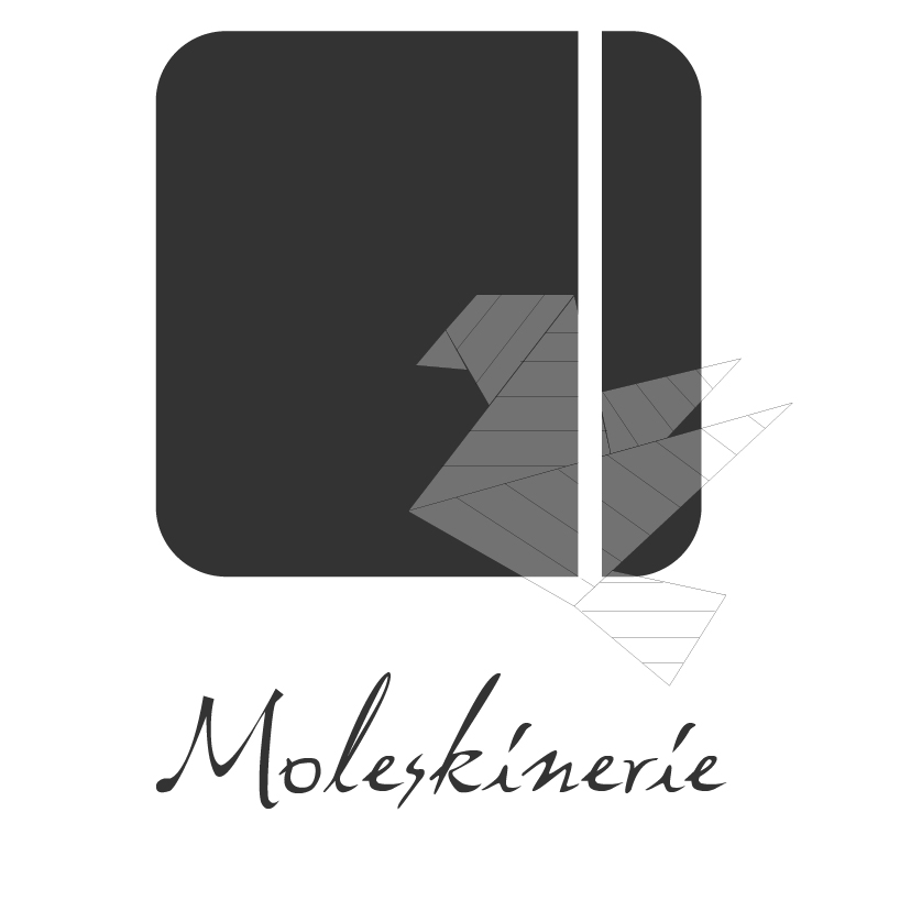
Creativity Logo Moleskinerie by Cátia Machado from portugal
designer's own words:
to begin the elaboration of these logos I had to do a research to discover what is behind this brand. so, for this logo i reproduced a vector of a paper bird, like origami, to enhance the creativity. this bird stands on a moleskine notebook to give the idea that it was made from the notebook sheets. so, creativity above all. the colors scheme is based on grey because i wanted to be more neutral and also because it gives the logo a smooth look. the center is white to create a contrast and gives the idea of a moleskine notebook inserted on the painting. the vertical pen works as a rubber band and it’s an important element because is what is used the most to write or even draw on the notebook. the lettering is hand written because of the theme. as we are spreading this brand it’s important to highlight the manual world.
Creativity Logo Moleskinerie