contemporary improving in blue by neven kosor from croatia
designer's own words:
after studying the concepts which most efficiently describe the company moleskine, i tried to simplify them as much as possible, as well as reduce their number to a minimum.
creativity, analog, blank pages, contemporary nomadism, network, digital, free platform, travel, memory, personal identity, imagination...
i conducted a test with several people close to me by giving them specific concepts and terms which describe the company today. i asked them to write a word/term or draw a simple drawing completely inspired by every individual concept.
the second step was instructing them to study the given group of concepts, and try to find and deduce a single concept/term which unifies them all most efficiently.
i came to the conclusion that the essence of company’s concepts lies in three terms: computer, lifestyle, and 21st century.
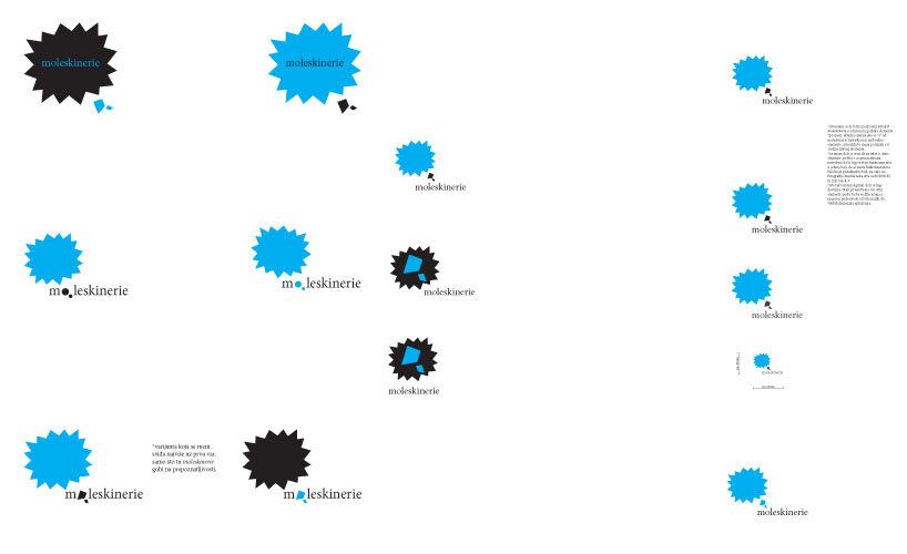
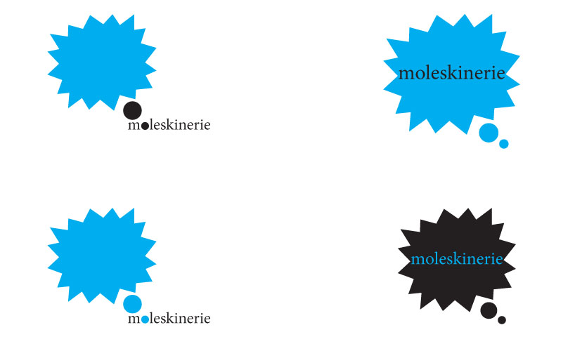
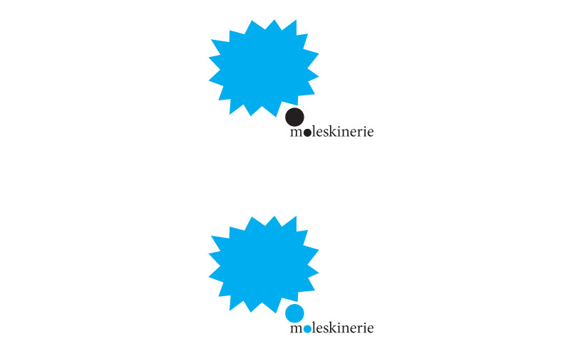
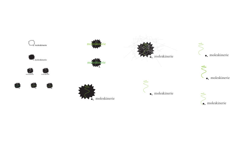
the basic element is inspired by a visually metaphoric symbol which describes something new, improved, advanced, and simultaneously defined by its own characteristic, personality.
the other two dotted symbols – down on the right, are taken over from the symbol which displays a cloud with two dots, and represents something imaginative and abstract, some personal thoughts.
the conceived elements, put together in a single unity, aim to synthesize the message of the brand logo in a most creative and imaginative way possible, in order to simply and precisely interpret the depth of the message.
blue speaks about consciousness, freedom and new beginnings. it enables view width on the very point of things and it supresses mutual agitativnost of shapes. in combination with formal and elegant black.