connect the dots by niko koronis from italy
designer's own words:
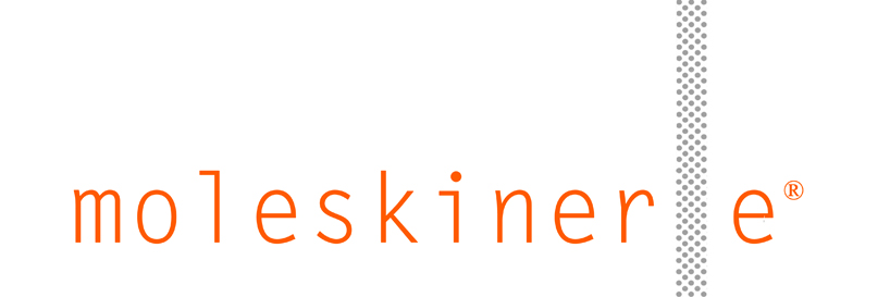
the logo designed for moleskinerie is inspired by some of the qualities that have made moleskine one of the world's most favourite brands. its simple and timeless character, as well as its legendary elastic band. it is a logo that is immediately recognized and which provides an ideal solution for reproducibility and readability. it manages to work equally well in both colour and black and white and can be easily readable in any format. its apparently simple appearance makes it able to work at any size and on a variety of media (even when slightly modified as it can be seen from the images attached) such as the web or in print.
shortlisted entries (2162)