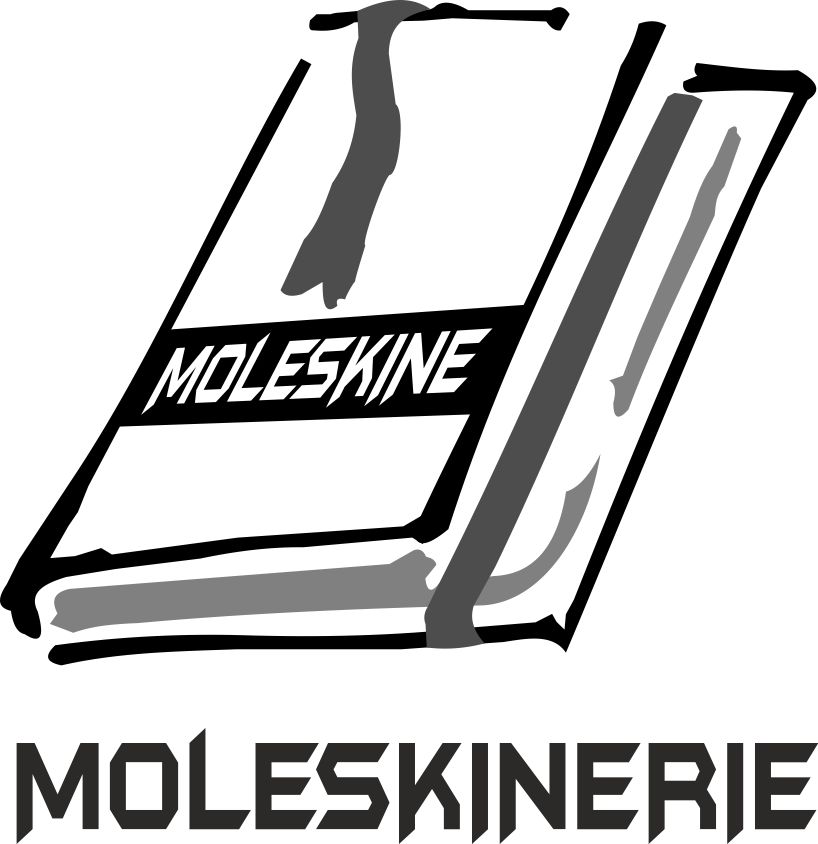
COMPETITION LOGO MOLESKINARIE by Patrick Alexander Semedo Gomes from portugal
designer's own words:
Specification
MOLESKINERIE LOGO COMPTITION
The proposal is based on the interpretation of many different concepts that we reflect and inspire the term "Moleskine", while having correspondence with the public and business activities whose objective is to serve.
Principal component semi-animated figure, symbolizing and representing the foundation of all context, a subtle interaction with other elements, giving the idea of something synthesized Organization, which in turn symbolizes the growth and success of the service that comes down to the custom "MOLESKINERIE" that gives more life to the logo, simplifying the most of your aesthetic, while representing their own brand of unique features;
The characteristics that distinguish them are:
Rounded corners, an elastic strap to keep it closed (or open a particular page) and a sewn spine that allows it to remain flat (180 degrees) while open.
However, we could not stop playing with colors, giving preference to your request; was prepared in a transparent background allowing the printing of the same in any color background, the evidence is strong that is, it eludes us a stability constant giving emphasis to and feeding the image overall.